Ask Richard: Pigment Sticks

Portrait of Richard Frumess in Pigment Sticks by Dorothy Wiegner in 1994.
This week we return to our Ask Richard series to take a deeper dive into all things Pigment Stick® with founder Richard Frumess. For those of you that haven’t experienced the magic and immediacy of working with them, R&F Pigment Sticks® are oil paint with just enough wax to be molded into stick form.
What makes R&F’s color line unique? One of the hallmarks of the R&F color line is the number of mixes we make. Of our 103 colors, just under half are mixes. Some are simple mixes of two colors. Others are more complex, comprising three, four, and even five different pigments.
Certainly life would be easier for us if we simply produced single colors, but then you wouldn’t have Sap Green, Turkey Red, Indigo, the Sanguine Earths, Celadon Green, and so on.
How is an opaque color different from a translucent color? Mixing is part of the art of painting. What you get depends largely on whether a color’s pigment is opaque or translucent. Opaque pigments have different effects than translucent ones whether they are used singly by themselves or in mixes.
Learning about opacity and translucency enables artists to have greater command over techniques such as glazing, layering, and color mixing.
The opacity of a paint describes how it interacts with light. Opaque colors hide what is underneath them. Translucent colors allow some light to pass through and partially reveal the underlayer. Learning about opacity and translucency enables artists to have greater command over techniques such as glazing, layering, and color mixing.
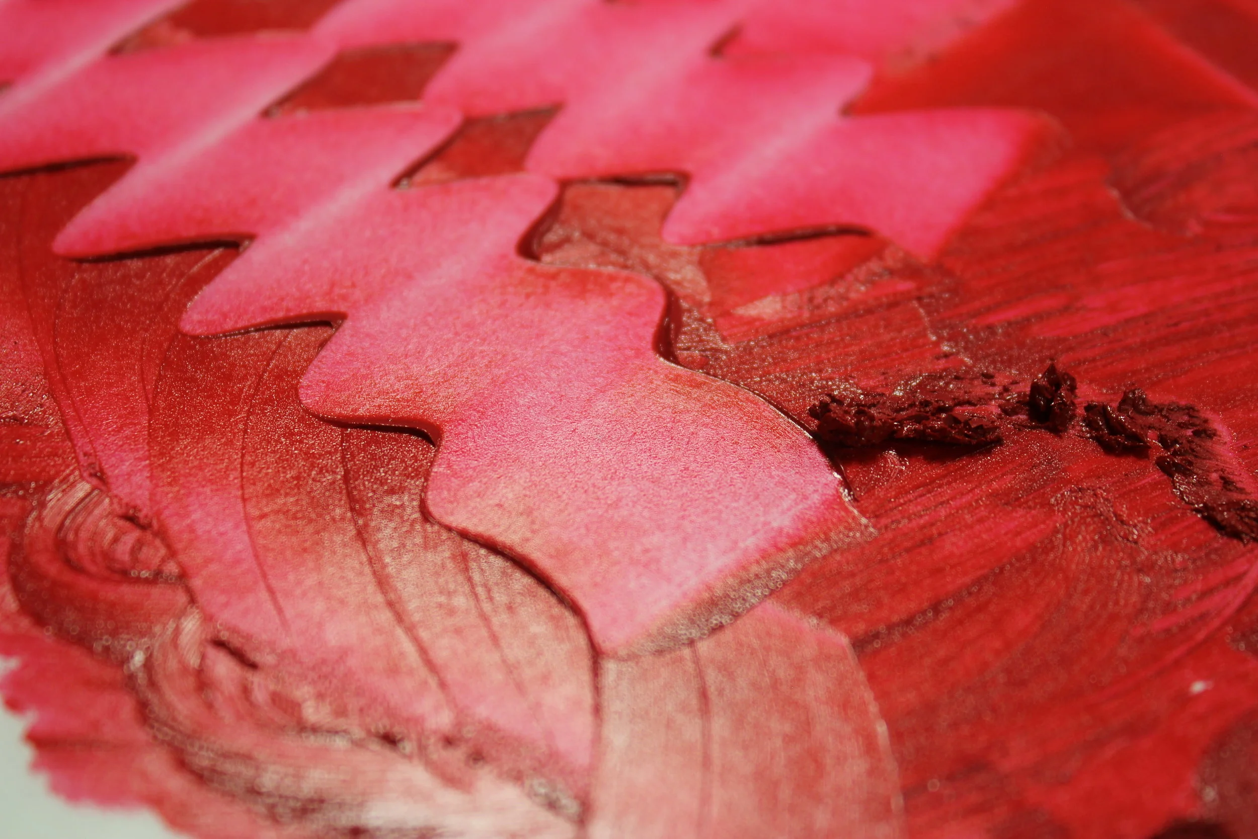
Quinacridone Red Pigment Stick® extended so that both its top tone and undertone are observable.
How can students learn about the differences between opaque and translucent colors? Here is a helpful exercise. You will need three pieces of canvas paper or some other non-absorbent surface; R&F blending medium; a Cadmium Red Deep Pigment Stick® (opaque), a Quinacridone Red Pigment Stick® (translucent), and a Titanium Zinc White Pigment Stick®; and a pair of disposable gloves.
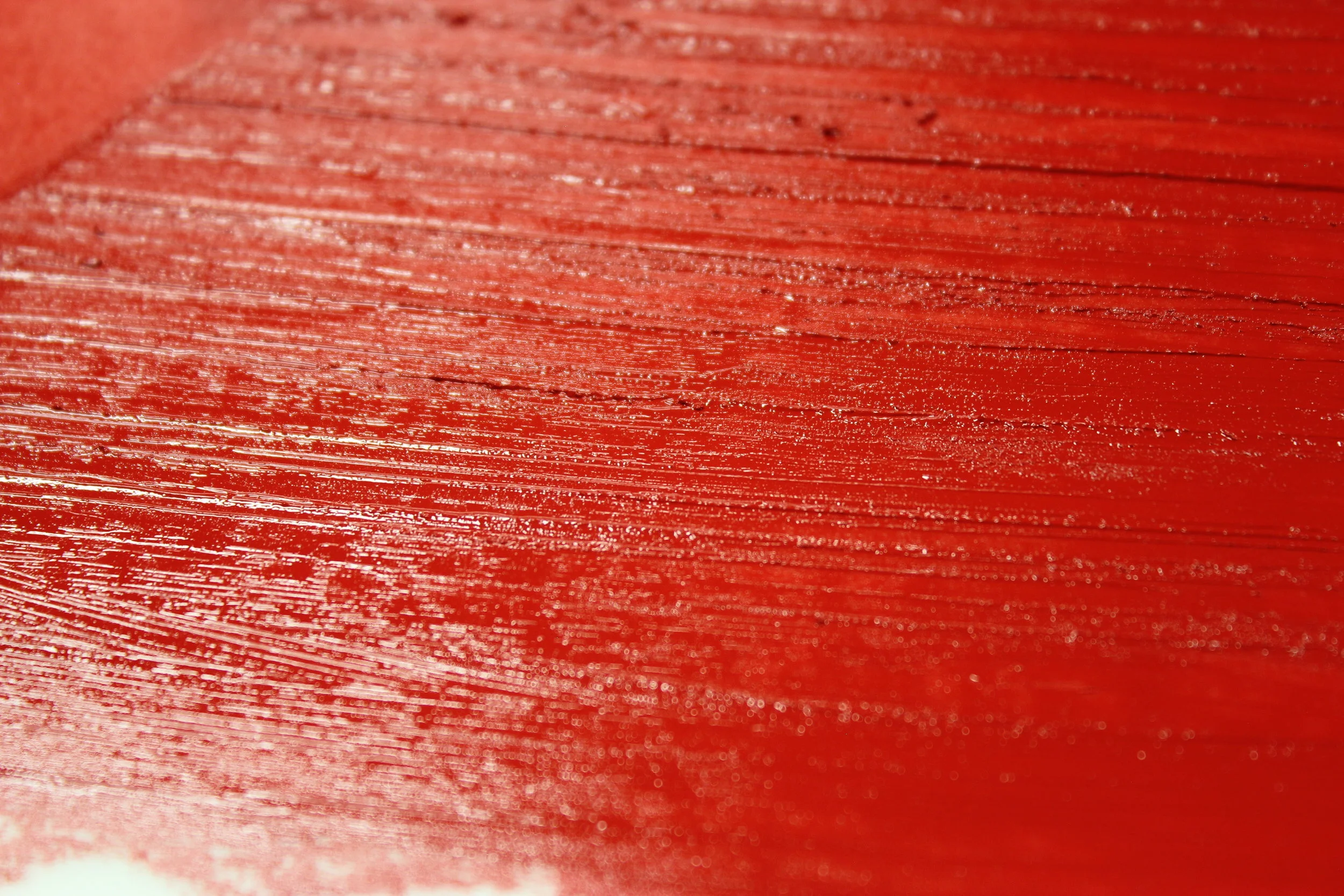
The luscious top tone of Cadmium Red Deep Pigment Stick®.
Top Tone & Undertone: Take each color and paint them side by side. Note that it is easier to make a solid covering with Cadmium Red Deep than Quinacridone Red. Opaque pigment has a strong top tone. Translucent colors have a weak top tone.
Now add some blending medium and work it around with your gloved finger. The undertone is observable when a color is thinned out enough that it looks translucent. Observe how pronounced the contrast between top tone and undertone is in the Quinacridone Red. A translucent pigment has a strong undertone, while the undertone of an opaque pigment is weaker.
Glaze: On a new sheet of paper use your gloved finger to extend the colors way out with the blending stick so that it shows only the undertone and little or no top tone. See how more vivid and jewel-like the glaze of the Quinacridone Red is compared to the Cadmium Red Deep.
Tint: Add Titanium Zinc White Pigment Stick® to both colors and paint them onto your final sheet of paper. Notice how muted the Cadmium Red Deep tint is compared to the Quinacridone Red.
Can’t get enough of R&F Pigment Sticks®? Check out artist Charles Forsberg painting with R&F Pigment Sticks® in Berlin. While you’re there, subscribe to our YouTube channel so you don’t miss any of our upcoming technique videos!