
Ask Richard: Achromatic Blacks, Chromatic Blacks & Chromatic Whites

Portrait of R&F founder Richard Frumess in Pigment Sticks by Dorothy Wiegner in 1994.
Back by popular demand…another in our series of “Ask Richard” blog posts. We sat down with R&F founder Richard Frumess to learn a little bit more about the categories achromatic black, chromatic black, and chromatic white, and how we might apply these categories to our own painting practices.
What do the categories chromatic black and achromatic black refer to? What about chromatic whites?
Achromatic black refers to carbon-based blacks such as Ivory, Lamp, and Carbon Blacks or to Mars Black, which is iron based. The reflectance from these blacks is very low so there is little variation between them when used opaquely.

Phthalo Green and Quinacridone Red are both transparent colors.
However, when any of these in Pigment Stick form are extended out with Blending Medium (or in the case of encaustic paint extended with encaustic medium), or if they are mixed with white, they show a surprising, if subtle, color range that can have a great effect on monochromatic work or in color relationships. They can also be used in mixes with colors to darken them without seeming to add in another color.
Chromatic blacks are mixes of dark, mostly translucent colors. An example of a combination might include complements such as Phthalo Green and Quinacridone Red. R&F's Complex Earth colors, such as Payne's Grey, Turkey Umber Greenish, Indigo, Courbet Green, and Blue Ochre are also versions of chromatic blacks.

Turkey Umber Greenish, Payne’s Grey, Courbet Green, Blue Ochre, and Indigo are all semi-transparent colors.
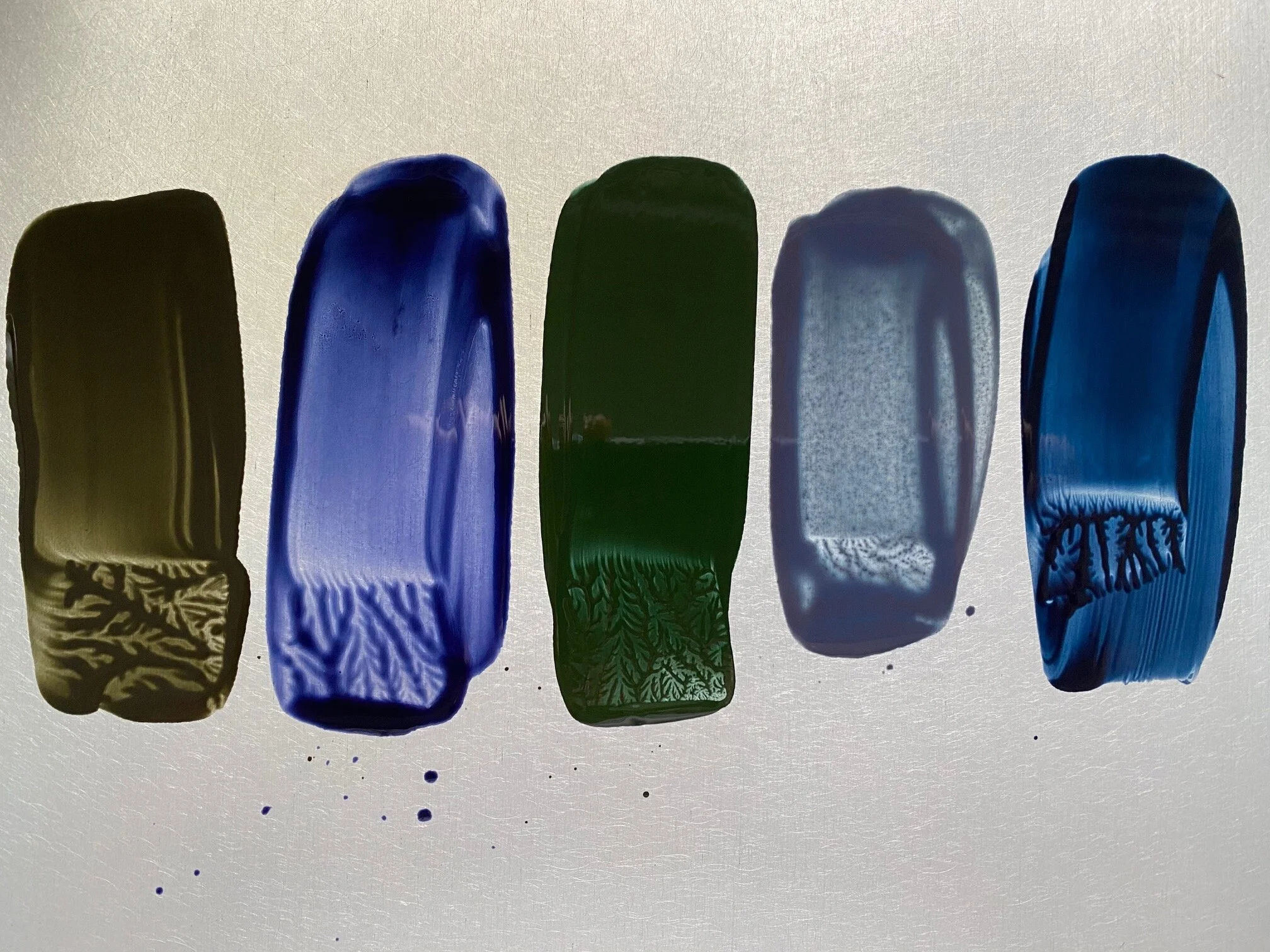
From left to right on the heated palette: Turkey Umber Greenish, Payne’s Grey, Courbet Green, Blue Ochre, and Indigo.
The darkness of a chromatic black imitates the darkness of achromatic blacks, but it is more saturated. In relationship to other colors, it will appear like either a very strong black or a dark version of one or more of its component colors. When a chromatic black is extended out or mixed with other colors, it will reveal a surprising variety of undertones.

Left to right: Cerulean Blue surrounded by Titanium White, Scarlet Extra Pale, and Cobalt Blue.
Chromatic whites are a different story. These are our very pale tints that, because of their low saturation, are highly influenced by more saturated colors and by other chromatic whites. They are chameleon-like in that they can appear either as a color or as an off white, depending on the saturation, value, and hue of relating colors.
For example, Cerulean Extra Pale surrounded by white is much bluer than when surrounded by Cobalt Blue or Alizarin Crimson where it appears off white. But when surrounded by Scarlet Extra Pale, it becomes much darker. A chromatic white is very useful in a painting where it imitates a white without popping the way Titanium White can do.

For any of you interested in learning more about color, Richard recommends David Hornung’s classic Color: A Workshop for Artists and Designers.