
Ask Richard: Green Earth

Color mixing is an art. We take it very seriously at R&F. Tour our paint-making production facility and chances are you will see us testing color to make sure we get it just right.
Each of our color swatches is a study in and of itself. We check the subtle shifts in color, gradations, and undertone to ensure our paint meets our standards. Since 1988, our primary goal has been the development of an extensive and unique color line. We take pride in creating the highest quality products we can and consistency is an important part of that process.
If you’ve been to R&F recently for a workshop, you might have seen a small framed scrap of paper with different swatches of color on it hanging in one of our offices. We reached out to founder Richard Frumess to see what he could tell us about this color study and got a tiny peek into the history of R&F and the evolution of color.
Enjoy. And keep painting.
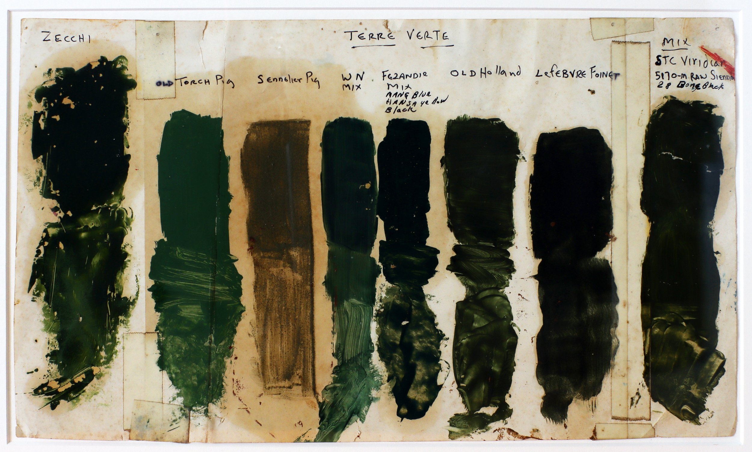
“This chart dates to my painting days in Brooklyn before I started R&F. I was comparing, as you can see, different brands of Terre Verte (Green Earth). Some were mixes, some genuine earth. I liked Old Holland's the most and felt I came pretty close to it with my mix.
When I decided to add Green Earth to our color line for R&F several years later, I knew I'd have to mix it since genuine Green Earth is heat sensitive and browns.
I thought it would be no big deal since I already knew the mix. But when I tried it, it didn't work. It looked like mud. So I tried other combinations with the same result. I was very puzzled and tried numerous pigment combinations and proportions. They didn't work either.

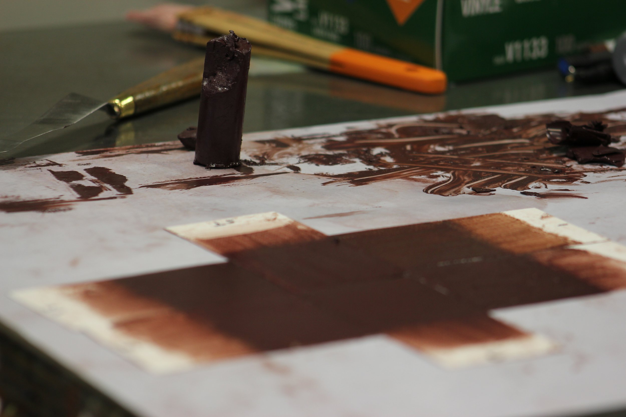
R&F’s Green Earth Pigment Stick®.
I worked on it for months until I realized the problem. I was intent on making heavily pigmented paint, which is fine in single colors and most opaque mixes. But for translucent mixes employing earth pigments, the pigment load needed to be reduced to bring out their undertones.
The minute I did that, all the mixes I tried were close, especially my original mix of Viridian, Raw Sienna, and Ivory Black. I switched out the black for Ultramarine Blue, which made the color sweeter. And later, when we added Stil-de-Grain to the line we used that to replace the Raw Sienna, which gave the color more clarity.
The concept of varying the pigment load to bring out all the tonalities of the color laid the basis for our complex earth mixes and their magical shifts in color as the pigments separate out in manipulating the paint.”
-Richard Frumess