Notes on Color: Brilliant Yellow Extra Pale, Cobalt Turquoise & Veronese Green

We’re back with another edition of Notes On Color - our platform for sharing our thoughts on color. This week we’re highlighting Brilliant Yellow Extra Pale, Cobalt Turquoise, and Veronese.
Just a reminder that you can find all our blog posts - from tips on color mixing to suggestions about how to choose a color - neatly organized for you on our Articles & Links page.
Enjoy. Keep painting.
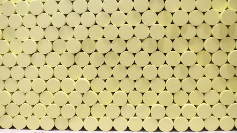
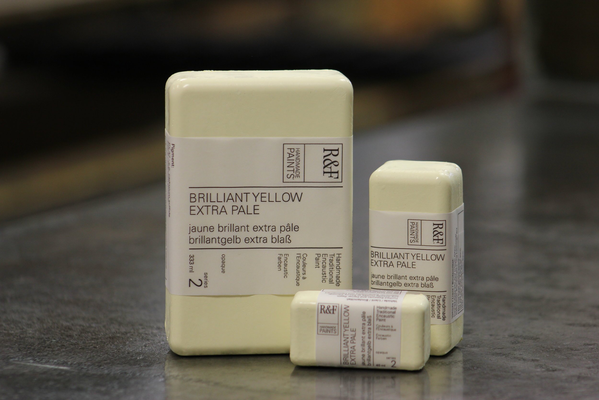
Brilliant Yellow Extra Pale. Its paleness makes it more of a warm yellowish off-white than a true yellow. Has the effect of soft diffused light.
Available in both our encaustic and Pigment Stick® color lines. Opaque with a Pigment Stick® drying rate of slow.
Chemical Composition: Titanium-Zinc White + Cadmium Yellow.


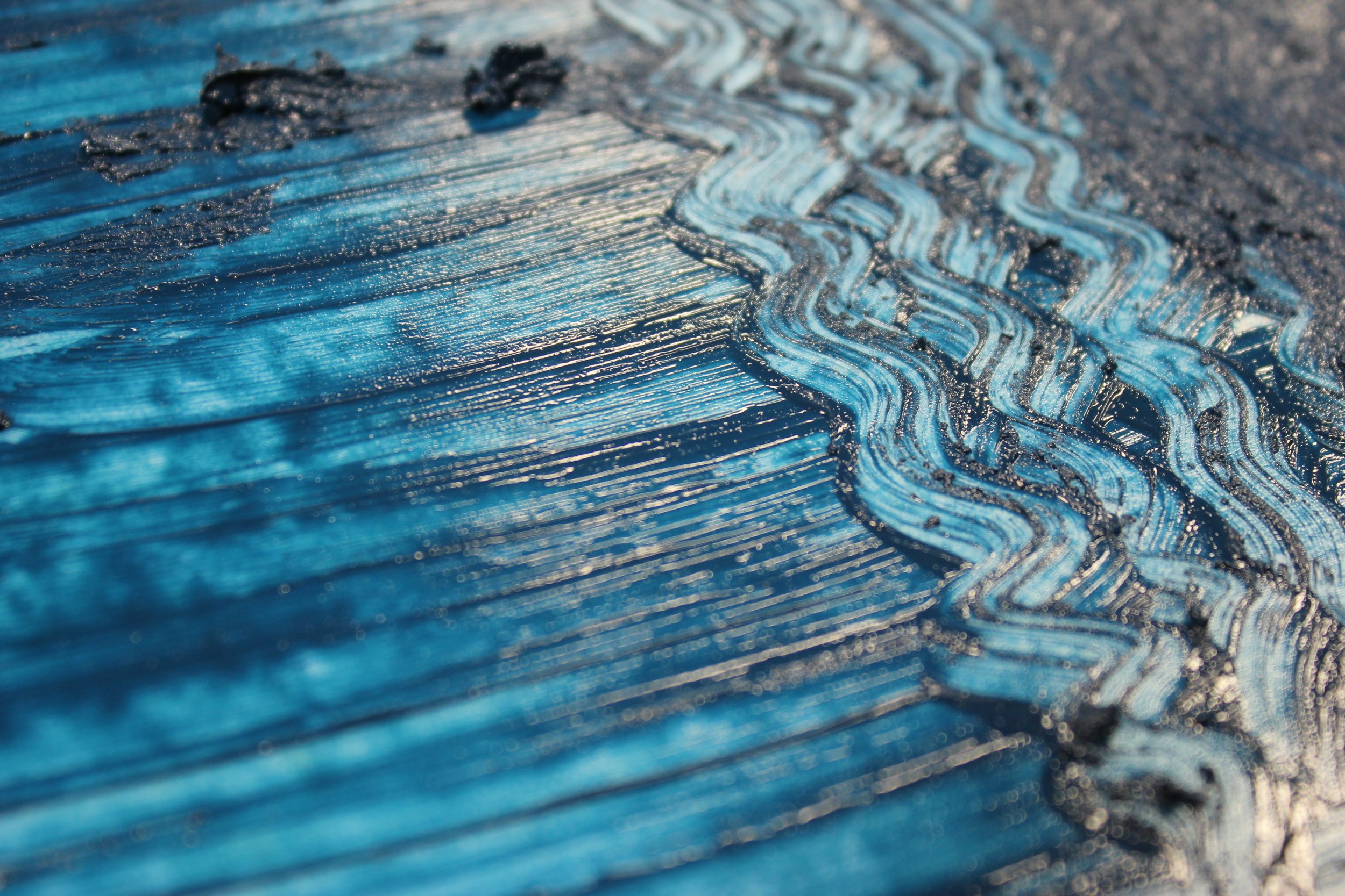
Cobalt Turquoise. Our Cobalt Turquoise has a deep vivid greenish blue undertone, while its top tone is dark and somber.
Available in both our encaustic and Pigment Stick® color lines. Semi Transparent with a Pigment Stick® drying rate of fast.
Chemical Composition: Cobalt Blue + Viridian.


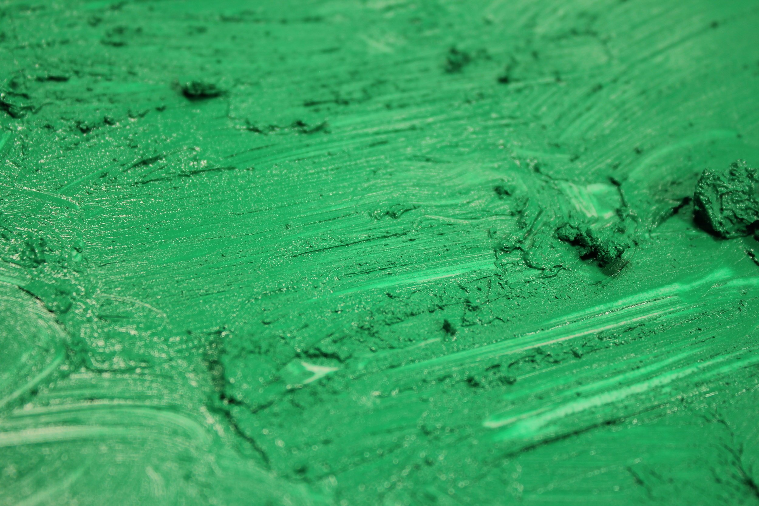
Veronese Green. Brighter and bluer than Cadmium Green. Favored by the French Impressionists. The original (no longer made) was arsenic based and very toxic.
Available in both our encaustic and Pigment Stick® color lines. Opaque with a medium Pigment Stick® drying rate.
Chemical Composition: Cadmium Yellow, Phthalo Green, Titanium-Zinc White.