
Color Mixing with Julie Snidle and Dietlind Vander Schaaf

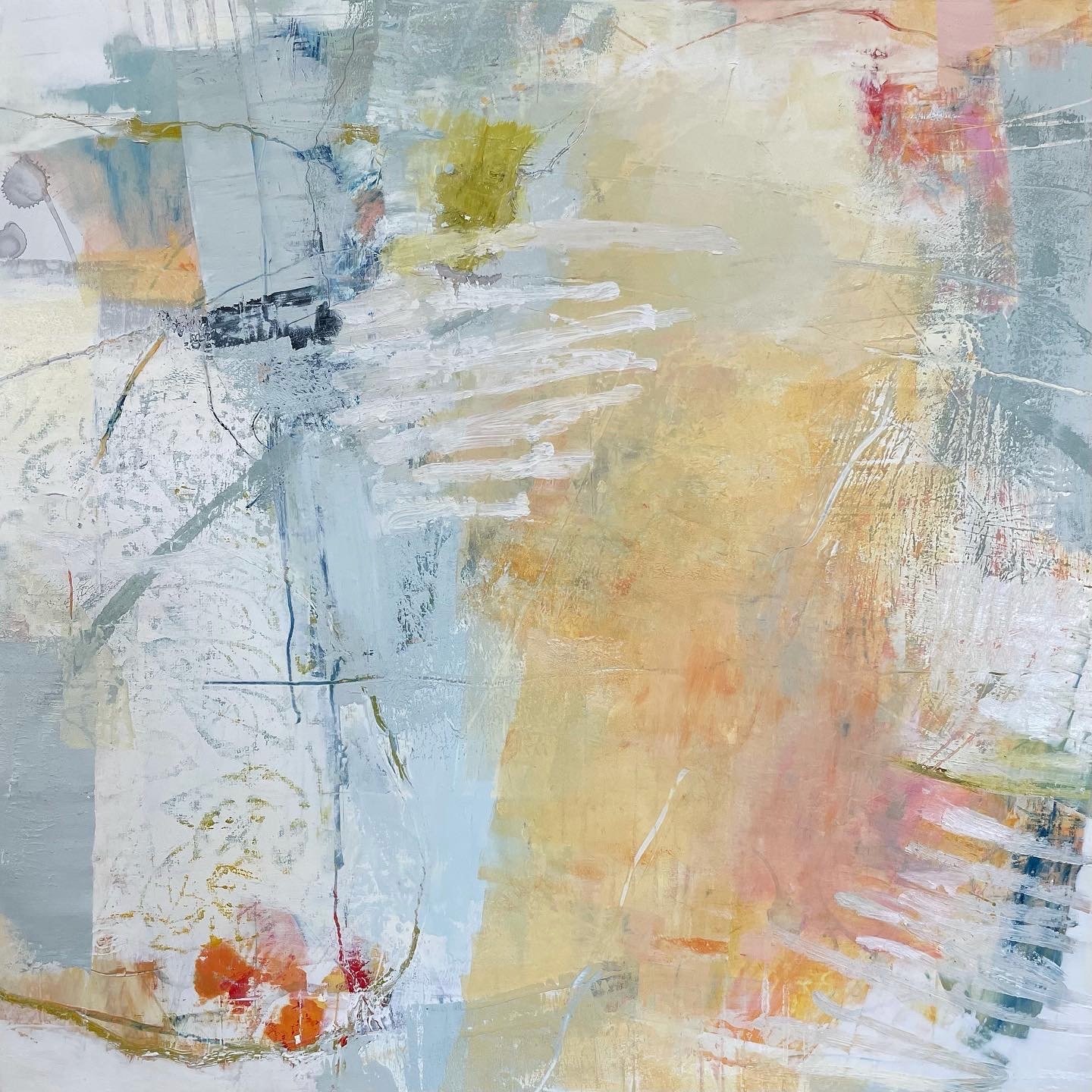
Julie Snidle’s sampler board using Paynes Grey, Cadmium Red Medium, Cadmium Yellow Light, and Titanium White.
Recently we chatted with instructors Julie Snidle and Dietlind Vander Schaaf about their favorite color mixes. Julie creates a wide range of colors in a playful and experimental manner using a limited palette. Dietlind uses a combination of colors to make chromatic black underpaintings.
However you approach color mixing - whether systematically and methodically or with more of a carefree attitude - we hope this inspires you to begin experimenting in the studio.
Julie Snidle, Peaches for Breakfast, 18” x 18", oil and cold wax on Ampersand Gessobord.
Julie Snidle
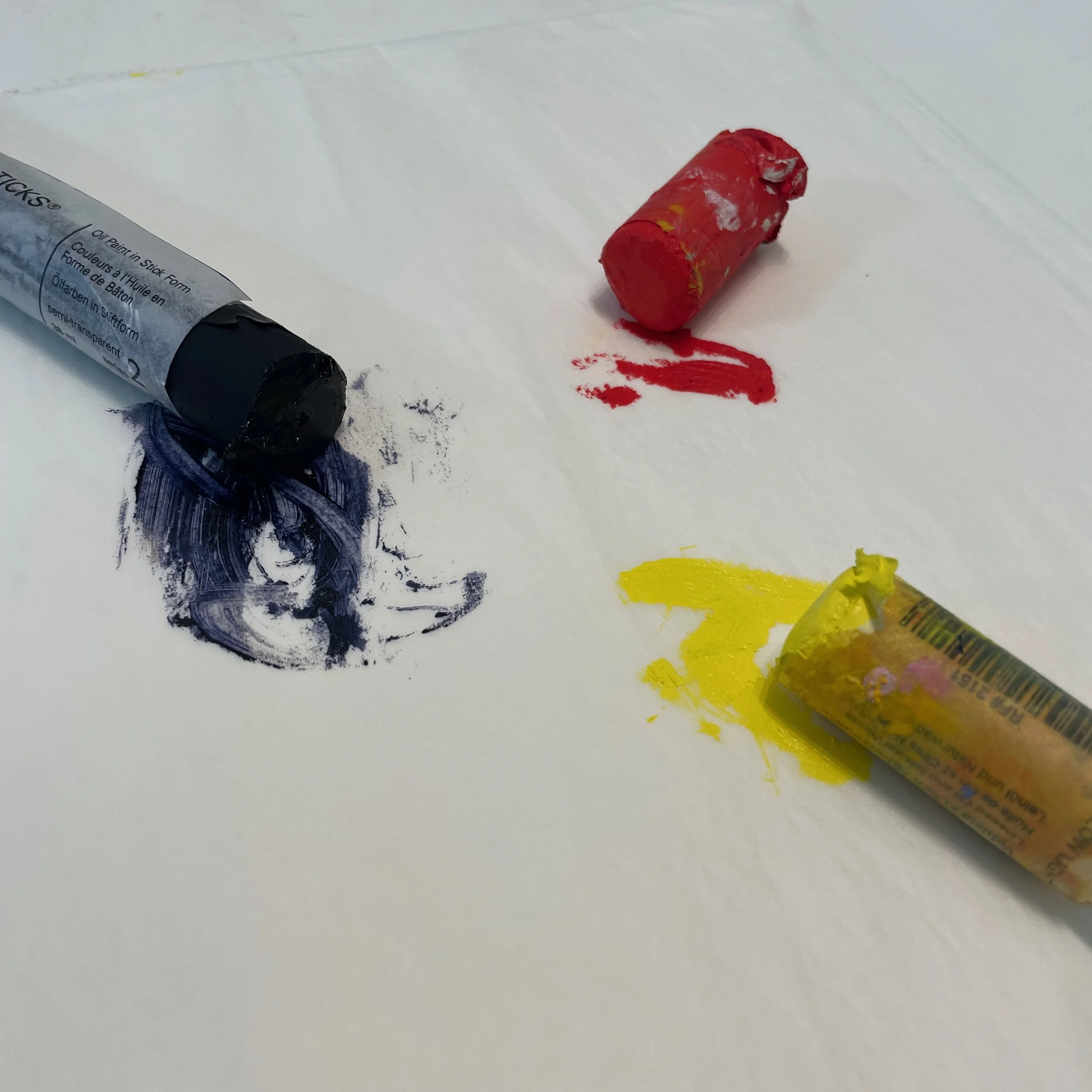
"One of my favorite studio pastimes is trying out new color combinations. I love using R&F's Pigment Sticks® for this because they're ready to go; no brushes or set-up required. I test combinations on palette paper and transfer the best ones to a sheet of Arches oil paper using a palette knife. I've always been intrigued by the possibilities that a limited palette can offer.
There is no particular order on the sampler board above. My goal here was to create as many combinations as I could without repeating colors. I have made more formal charts where colors intersect on a grid, but on this board I was just playing, experimenting, making a game out of it. Look at the wide range of hues and values you can make from just Paynes Grey, Cadmium Red Medium, Cadmium Yellow Light, and Titanium White.”

Dietlind Vander Schaaf, Cloudscape, 40” x 40” encaustic, oil, and 23 karat gold leaf on panel.

Underpainting using a combination of Intense Carbon Black, Phthalo Turquoise, and Cobalt Blue.
Dietlind Vander Schaaf
“I frequently create chromatic black underpaintings with either blue or green tones for my larger work. To create a blue-black mix, I add Cobalt Blue, Cobalt Turquoise, or Phthalo Blue encaustic paint (or some combination of these blues) to black encaustic paint. For a black-green mix, I choose either Courbet Green or Green Earth encaustic paint. The ratio is approximately 1 part black to 2 parts color, but it’s really experimental. No strict recipe. I prefer Intense Carbon Black for my black. In a pinch I use Ivory Black or Mars Black, but Intense Carbon Black is my favorite because it is the blackest of R&F’s color line and has a gorgeous matte surface when it cools.
When mixing color, I work directly on my palette, manipulating paint with my brush and a silicone Catalyst wedge. I look for that sweet spot where my paint looks dark, but a couple of test strokes reveal either a blue or green tone that can be extended and manipulated by adding medium.
Though my underpaintings read as black from a distance, up close it is apparent that there is more complexity in the dark patches and they subtly connect the various sections of my work. In my painting Cloudscape (above), for example, you can just make out that the dark section at the top has blue in it.”