Notes on Color: Chromatic Tones

Recently we chatted with R&F founder Richard Frumess about the decision to make a Chromatic Tones Color Set in both our Pigment Stick and encaustic paint lines.
"Value plays a huge part in how chromatic whites operate. This an important part of color theory and helpful for students to understand. One way to demonstrate this is to start with black and white backgrounds, because they're the extremes of value, and then move on to how the chromatic whites play off stronger colors.”
So we did.
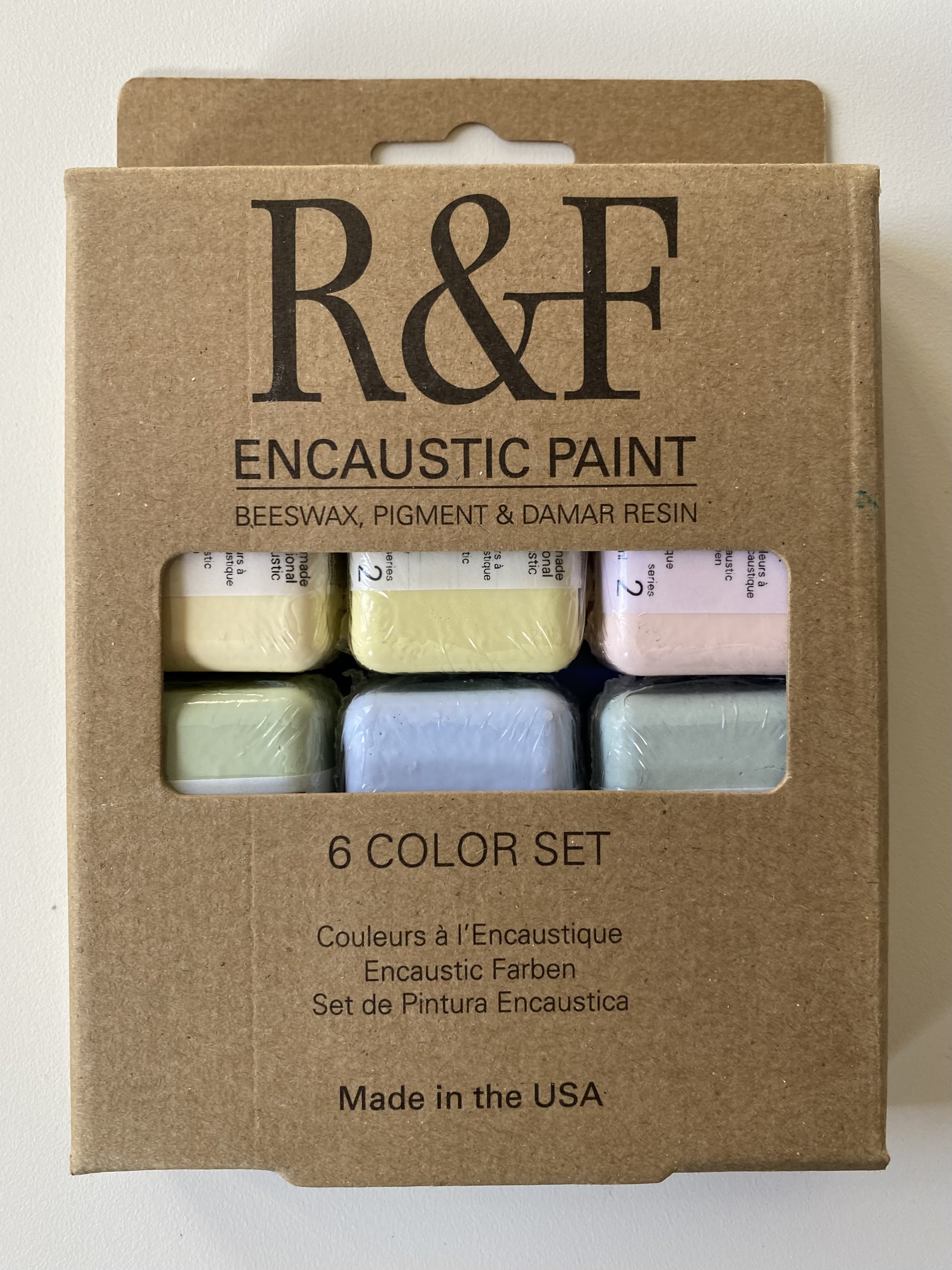
Our Chromatic Tones Color Set (for those unfamiliar) consists of of six tints in 40 ml cakes. It includes Brilliant Yellow Extra Pale, Celadon Green, Cerulean Grey, Green Gold Pale, Scarlet Extra Pale, and Ultramarine Blue Pale.
Placing a stroke of each of our our Chromatic Tones Color Set on black and white backgrounds shows the effect of achromatic value on chromatic whites.

From L to R: Cerulean Grey, Brilliant Yellow Extra Pale, Scarlet Extra Pale, Celadon Green, Ultramarine Blue Pale, and Green Gold Pale.
Try this for yourself. When you experiment, you will see that a white background, which will contrast less with a chromatic white, will make the chromatic white look darker and tend to bring out its color. It may also make it look slightly grayish. A black background will tend to bring out its whiteness.
Richard suggests you then take one step further on the black background and lay a brush stroke of Titanium White anywhere on the panel. This will have the effect of causing your chromatic white to stop looking so white and reveal its color.
The push and pull of color interaction adds another dimension to the effect of value. A quick way to see this is to do an experiment with Phthalo Green Pale.
Try laying a wide stroke down on a background of Chromium Oxide Green, Cadmium Yellow Light, Celadon, and Scarlet Extra Pale.

From L to R: Phthalo Green Pale encaustic paint on Chromium Oxide Green, Cadmium Yellow Light, Celadon, and Scarlet Extra Pale.
The Phthalo Green Pale appears lighter on Chromium Oxide Green because the very strong green of Chromium Oxide Green is pushing the weaker green of Phthalo Green Pale away from green.
Compare that to Phthalo Green Pale on Cadmium Yellow Light where the yellow pushes Phthalo Green Pale away from yellow toward blue. On Celadon and on Scarlet Extra Pale, there is very little contrast value, so the Celadon pushes the Phthalo Green Pale toward blue. Scarlet Extra Pale pushes the Phthalo Green Pale toward green in a more subtle fashion.
Below you will find a video demonstrating the differences in value produced by our Chromatic Tones Color Set. You can find all kinds of additional helpful content - from tips on color mixing to artist spotlights - neatly organized for you on Articles & Links, as well as over 18 demo videos hosted on our YouTube channel.
Enjoy. Keep painting.
What to learn more? Richard will be teaching two upcoming workshops on color.
3/23 - 25: What Makes Encaustic Different in Creating Color Effects? co-taught with Leslie Giuliani, R&F Handmade Paints, Kingston, NY
6/6 - 8: Solving Color Problems, Truro Center for the Arts at Castle Hill, Truro, MA