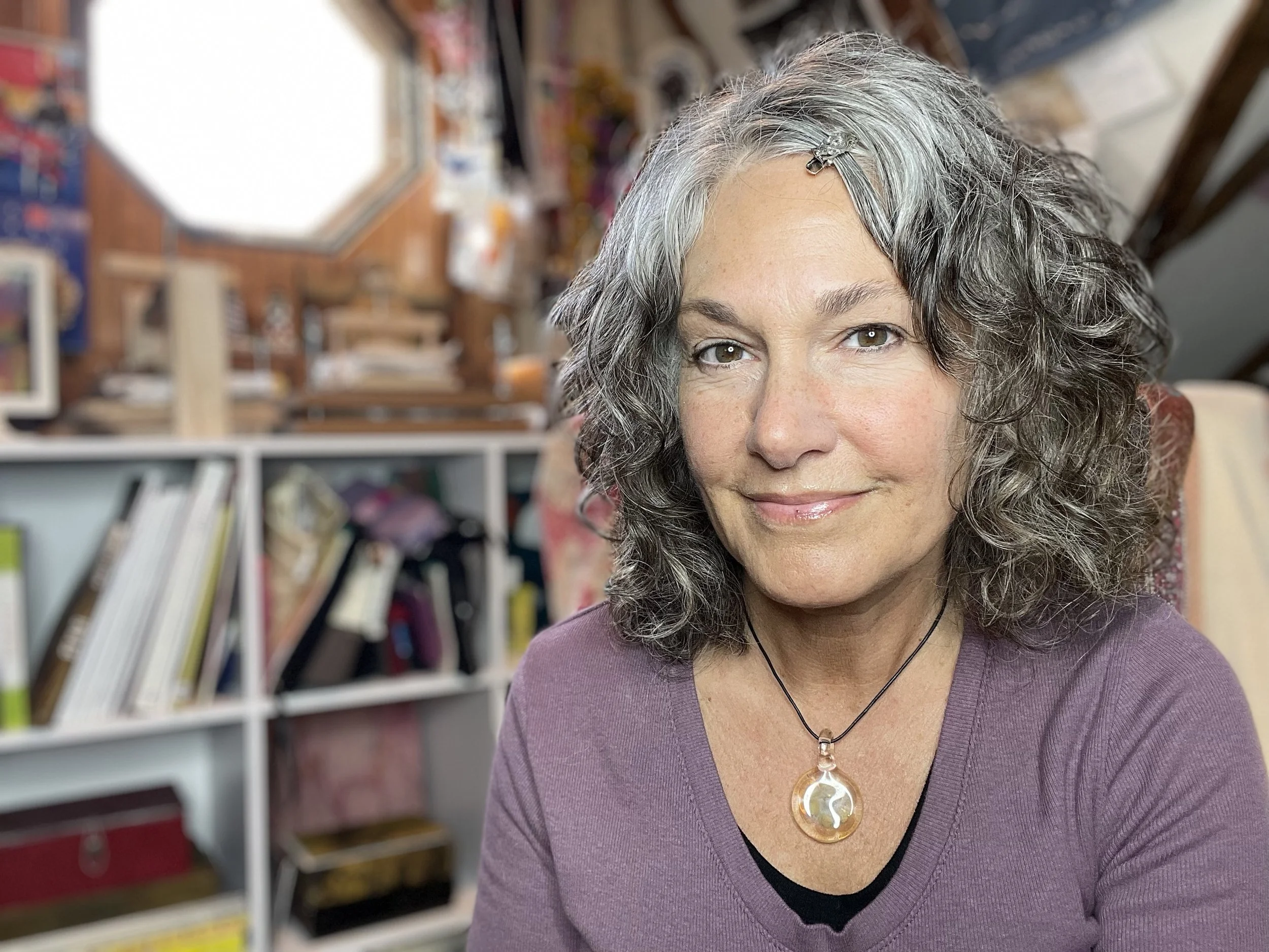
Artist Insights: “Colors I Can’t Live Without” with Lorraine Glessner
We’re kicking off a new series this year for Unique Color. Periodically we will be joined by a guest instructor sharing a tip, a recommendation, or a bit of advice — something they’d share with students in a workshop. We’re hoping this virtual sense of stepping into their classroom and gaining some artist insights helps you to try something new or refine a technique.
For our inaugural Artist Insights column, we are joined by Lorraine Glessner who highlights her go-to colors and unpacks why these paints are always in her palette. Learn how she creates the perfect white, which colors she uses to “sour” other colors, and how Mars Red was a revelation for her when she did a residency at Brown Pink. At the end, you’ll find a list of Lorraine’s upcoming workshops.
Enjoy. Keep Painting.
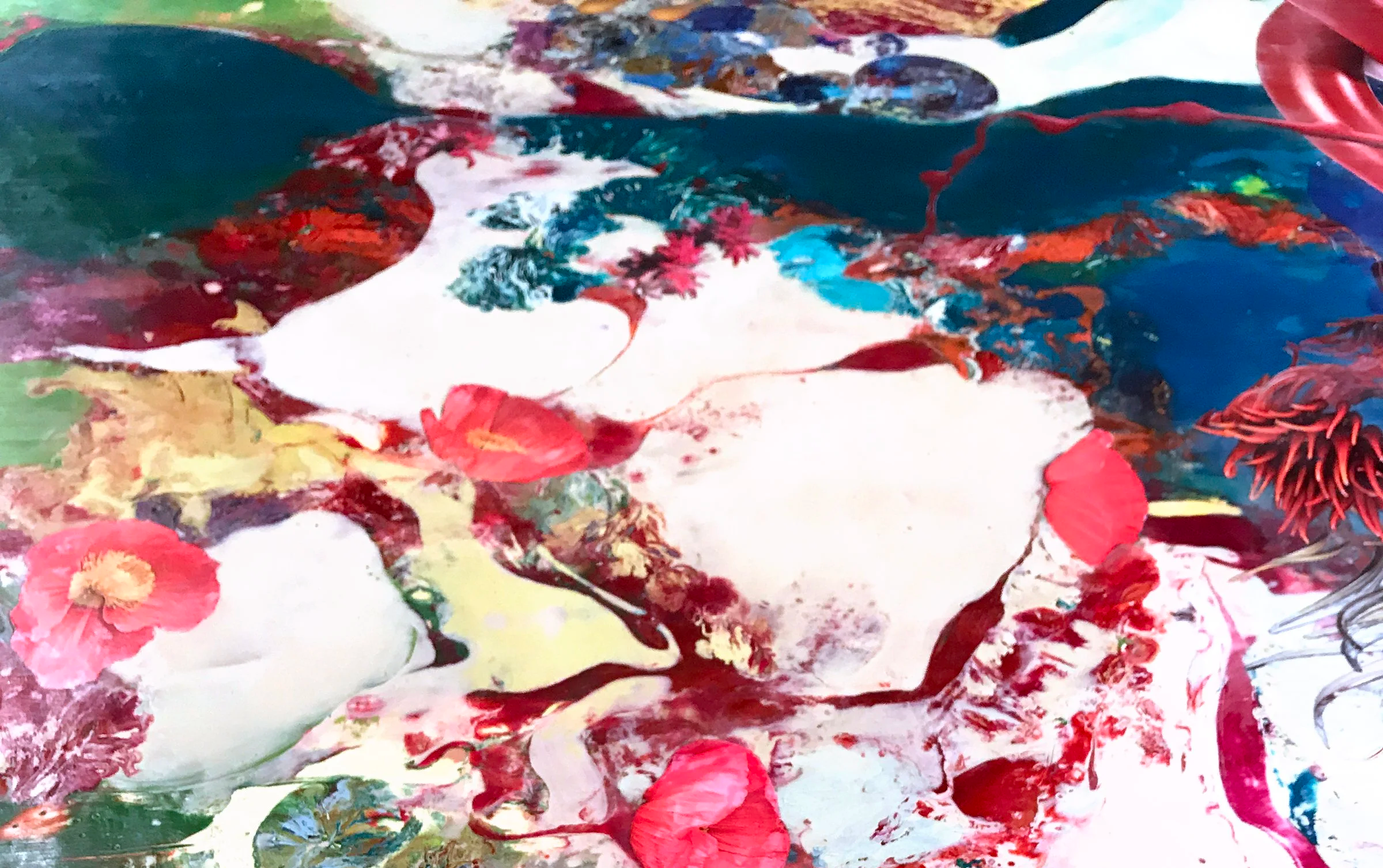
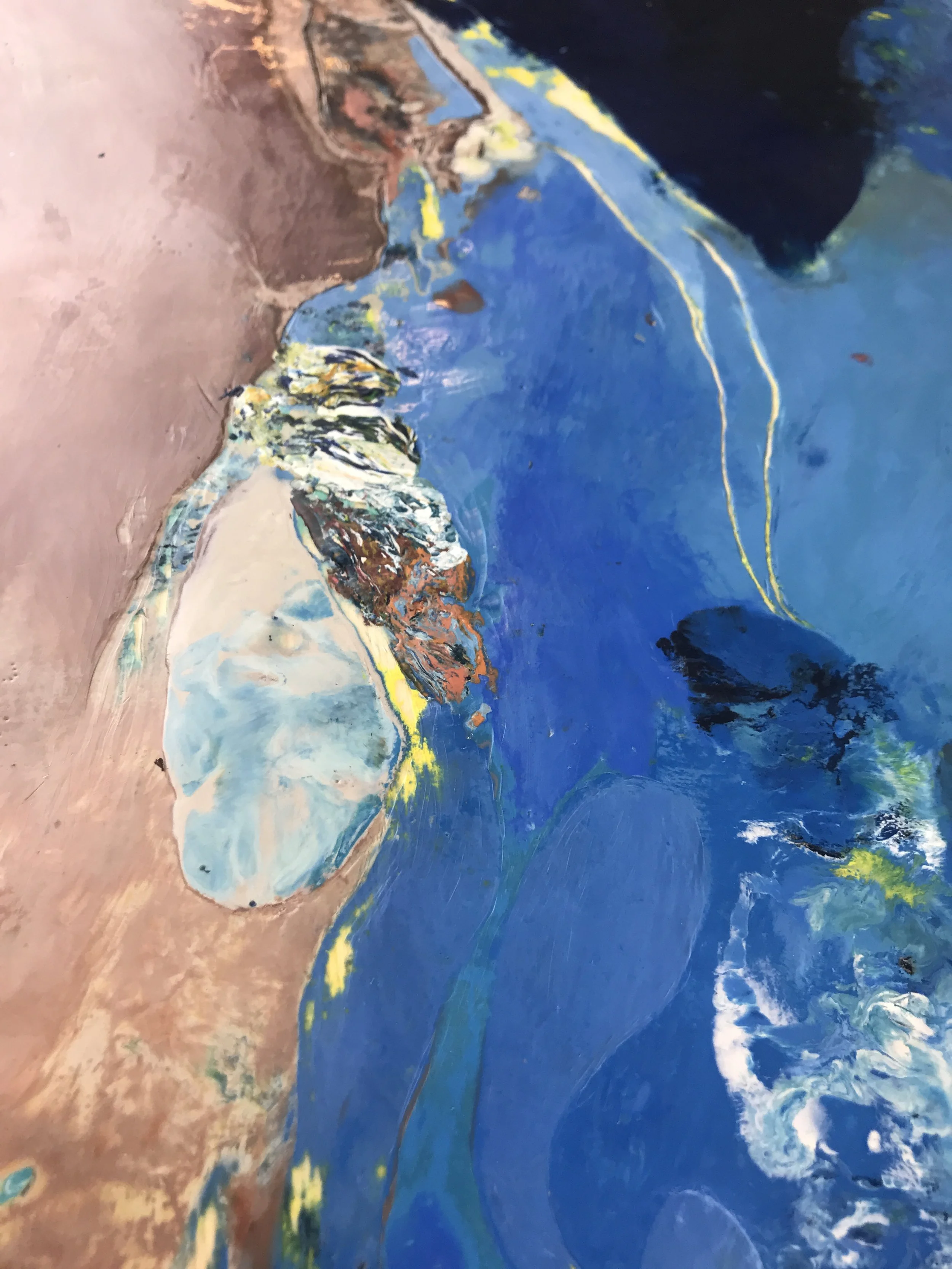
There are so many amazing colors in R&F’s encaustic color line, it can be overwhelming to choose. Encaustic is unique in many ways and one of the most frustrating is that it is sometimes difficult to tell what a color might look like when it’s melted, painted on a substrate, or mixed with medium.
I watch as my workshop participants choose color. Most tend to select the brightest, prettiest colors first. Often overlooked are the most amazing earth tones, grays, and colors that may look a little blah on their own, but when melted on the palette, truly come alive.
As you read through this list, please note that it is not to be used as a guide for color mixing or as basis for a beginner to start a color collection. Rather, these are the colors I choose to work with again and again; they are my favorites no matter the palette.
I also want to mention that I never use any color 'straight out of the tube.' All of the colors in my paintings are mixed, meaning they are created using a mix of two to five colors. I chose the colors listed below as a base because when added to other colors in small doses, they slightly alter those colors and create a more personalized palette for my work.
Last, these are by no means all the colors I use. These are simply the colors I use most frequently, the colors I never put away.
Whites
· Neutral White: This is the first color I purchased as a new encaustic painter twenty-five years ago and painted with it almost exclusively then. When mixed with any color, it lightens, adding opacity and a touch of earthiness. When mixed 50/50 with Titanium White, it creates the perfect white. Not as bright as Titanium White on its own, and slightly richer than Neutral White by itself.
· Titanium White: Almost too white. I primarily use it as a mixer to create the perfect white or with other colors to whiten and add opacity when I don’t want to add earthiness.
· Brilliant Yellow Extra Pale: I love using this color as a substitute for my Neutral/Titanium mixture. It not only whitens, it adds just a touch of whimsy as it brightens.
· Green Gold Pale: Not a true white, but I use it as such when I want to lighten or tone down a color. This is one of those colors that when painted next to almost anything makes it look fantastic.
· Sienna Yellow Extra Pale: I use this when I want to lighten and simultaneously add a warmer tone.
· Phthalo Green Pale: One of my favorite colors. It’s bright, it’s cool, and it adds just a little amazingness to any color it’s mixed with, yet always retains its strength.
· Cerulean Extra Pale: Not quite gray or white or blue, it's an amazing substitute for those colors when mixing and one of the few colors I’d use straight out of the tube.
Reds/Oranges/Yellows
· Warm Pink: Like neutral white, I have used this color since I started painting. It brightens any color and is vibrant when painted next to or on top of earthy blues, grays, or greens. Mixing with Warm Rose is my go to pink.
· Alizarin Orange: I LOVE this color. Bright and versatile, it can go from a light gold to a rich, rusty orange in one swipe. When mixed with white or any other color, it retains its richness.
· Olive Yellow: Use to 'sour' any color. It's just a bit off and when painted next to other colors, the colors sing.
· Cadmium Lemon: A great substitute for any of the cadmium yellows. Like Olive Yellow, it 'sours' anything it’s mixed with and makes pairing colors sing. Can also be used to lighten and brighten any color.
· Indian Yellow: I’m not a huge orange fan, yet find myself reaching for this color when I need a mixer with an orange leaning that also possesses gorgeous golden undertones.
· Cadmium Yellow Light: A clean, true yellow - this is my go-to mixer for any green, green/blue, orange or orange-red.
· Cadmium Red Medium: A true red that no artists encaustic stash should be without.
· Quinacridone Magenta Light: A must have color that is difficult to mix. One of the few I use ‘out of the tube.’ I also use it constantly as a mixer for lighter pinks, purples, even grays that I want to stay a bit brighter and not go dull as grays often do.
· Mars Red: I avoided this color until my residency at Brown Pink when I used it for the first time and experienced an aha moment. There was an instant recognition that it was the color I was always trying to mix when searching for a red to reference flesh tones important in my work. I mix it with Alizarin Permanent as well as Brown Pink and all make amazing rich reds. When mixed with any white, Mars Red makes the pink of my dreams. A great combination is painting this color next to any blue or blue-toned color to make both colors sing.
· Brown Pink: Like Alizarin Orange, Brown Pink has strong undertones and changes color from a subtle pink-taupe to a rich brown taupe. I frequently use it as a mixer to add a dark earthiness.
· Stil de Grain: Another sadly overlooked color. It looks dull and lifeless in the packaging. I didn’t begin using this until a few years ago and I was amazed at its lovely and rich undertones. This is another color that when painted next to almost anything will bring out the magic.
Blues/Greens/Purples
· Payne's Grey: I use this instead of black to darken colors. Black tends to deaden the color as it darkens, while Payne’s Grey allows the original color to retain its voice. I also use this color as a base mixed with darker colors to create my personal black. Mix this color with white and you have a large range of grays that never look dull.
· Cobalt Blue: A bright, clear blue. I use it more than any other blue and when I want a mixer with a purple leaning.
· Malachite Green: I use this color way too much. It's one of those colors that changes as it's painted next to different colors.
· Green Gold: I use this color in a similar fashion to Olive Yellow. It adds a bit of 'sour' to any color and makes other colors sing when its painted next to them.
· Turkey Umber Greenish: This is probably one of the most overlooked colors in the R&F line. Try mixing it with any blue, green, black for an amazing richness. Also, try adding just a touch of it to any warm color to tamp it down without making it dull. Paint it next to virtually any color to bring out the vibrancy and special qualities of both colors. Its truly one of those indispensable colors.
· Phthalo Turquoise: Another color that is hard to get a sense of in its cake form because it’s so dark. It is actually one of the brightest and most versatile colors. Add just a touch of any white and watch the magic happen.
· Phthalo Blue: I can’t say enough about how lovely this color is, it’s probably the brightest, richest, truest blue you’ll find. No matter what it’s mixed with, it retains it’s brilliance.
Metallic
· Ancient Gold: Sometimes a painting can use a little embellishment and I find myself reaching for this color repeatedly. It’s so gorgeously rich, yet never garish. The color is almost a tarnished gold, rather than a brassy gold which I respond to in jewelry and paint, adding just a subtle sparkle and touch of true class to any surface.
Lorraine’s upcoming workshops are listed below. To see more of Lorraine’s work, visit lorraineglessner.net.
April 6 - 10: Mixed Media on Paper & the Book, Aya Fiber Studio, Stuart, Florida
June 22 - 26: The Vermont Landscape as Muse: Encaustic on Paper & the Mark, Lareau Farm Inn, Waitsfield Vermont
August 3 - 7: From Plant to Pigment: Encaustic, Natural Inks & Watercolor, Lareau Farm Inn, Waitsfield Vermont
August 24 - 28: Layers of the Land: A Study in Abstraction, Encaustic & Place, Lareau Farm Inn, Waitsfield Vermont