Color Mixing with Jeff Hirst, Jodi Reeb, & Lorraine Glessner
We continue our series on color mixing with recommendations from instructors Jeff Hirst, Jodi Reeb, and Lorraine Glessner. (If you missed our previous color mixing posts, go back and check out Color Mixing with Debra Claffey and Susan Stover or Color Mixing with Julie Snidle and Dietlind Vander Schaaf.)
This week Jeff illustrates how he creates cool and warm chromatic grays. Jodi shares how she makes a variation on orange for her circle paintings. And Lorraine explains the way she creates the range of whites that can be found in her monoprints.
Enjoy. Feel free to tag us with photos of your color mixes on Instagram using the hashtag #rfpaints. We’ll share as many as we can in stories.
Jeff Hirst
“I often use chromatic grays in my work to play against more vibrant muted and prismatic color. For me, there’s a fine line between a muted tone and chromatic grays. I mix my grays using three primaries because I respond to the rich tonal qualities that I can get without using black.
To make the grays I use R&F Cadmium Yellow Medium, Cadmium Red Medium, and Ultramarine mixed with Titanium White. It’s a basic color mix but covers a wide tonal range that includes warm and cool grays.
I also use large amounts of encaustic medium with my grays (and other colors) to accentuate the luminosity of the encaustic. Often, I use vibrant underpainting to counter chromatic grays and muted tones with many layers of paint.”

Jeff Hirst’s color notes for mixing warm opaque and transparent chromatic grays.

Jeff Hirst’s color notes for mixing cool opaque and transparent chromatic grays.

Jeff Hirst, Subliminal Archetype, 27” x 26”, encaustic on shaped panel.
Jeff will be teaching Exploring Color with Encaustic August 8 - 10 at Grand Marais Art Colony in Grand Marais, Minnesota. This three-day workshop covers complex color relationships including chromatic grays, muted tones, and prismatic color; opaque and transparent surface; alternative fusing techniques; using complementary color surface manipulations and more.
To learn more, visit grandmaraisartcolony.org.
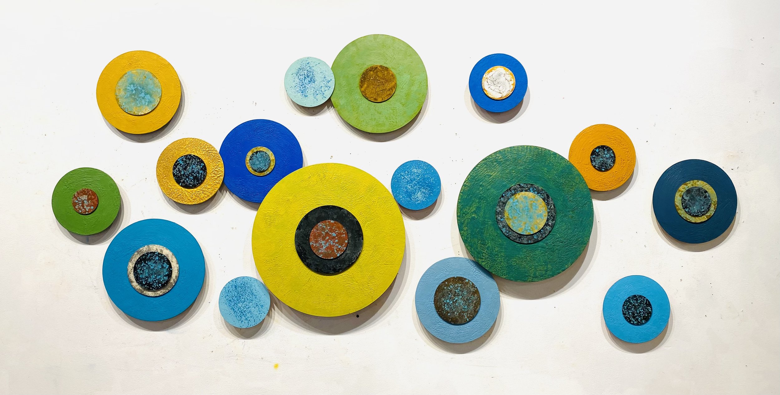
Jodi Reeb, encaustic and metallic paint on acrylic panels, 39" x 78" x 2", 2022.
Jodi Reeb
“My favorite color-mix is what I call "pumpkin" and consists of four colors: Cadmium Orange, Mars Yellow Light, Brilliant Yellow Extra Pale, and Burnt Umber. This mix creates a subdued orange hue to give my circular paintings a pop of color when Cadmium Orange is too bright. I love the range of blues and greens that R&F Handmade Paint offers and adding a warm color to the series provides a nice accent.
My color mixing proportions are 65% Cadmium Orange, 20% Mars Yellow Light, 10% Brilliant Yellow Extra Pale and 5% (a smidge) Burnt Umber. You can see the resulting color in the collection above. The ‘pumpkin’ painting is on the right, top-layered under the emerald green disk.”
June 24 - 26, Jodi will be teaching Encaustic with Photo Collage at Wild Rice Retreat Center in Bayfield, Wisconsin. This workshop covers creating translucent, layered paintings using photographs printed on light-weight tissue paper and embedded in encaustic medium and paint.
An overview of a variety of techniques will be demonstrated such as image transfers, mixing your own paint, creating texture and working with masks and stencils. To learn more, visit wildriceretreat.com.

Lorraine Glessner, God's Eyes, encaustic monoprint on masa paper, 21.5” x 15.5” (shows Titanium/Neutral/Brilliant Yellow Extra Pale Mix)
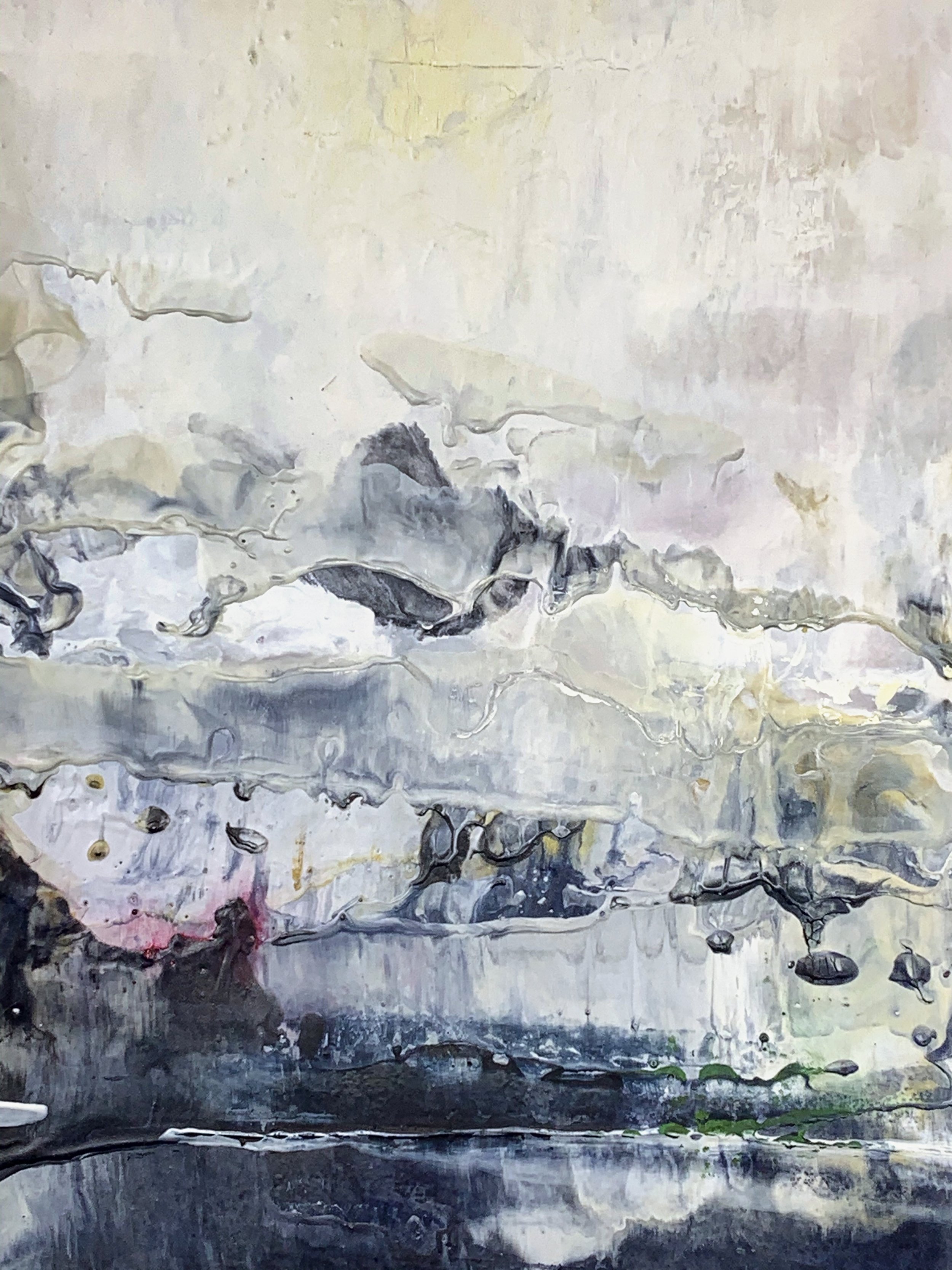
Lorraine Glessner, Hope (detail), encaustic monoprint on masa paper, 21.5” x 15.5” (shows all 3 color mixes)
Lorraine Glessner
Over the past year, I found myself turning away from the brighter colors I had been using and reaching for the whites, grays and earth tones. I rarely, if ever, use color ‘straight out of the tube.’ My colors are always made up of 2 - 5 colors and I encourage my students to do the same. Mixing your own colors allows for a more personalized palette and ultimately, a more personalized body of work.
One color mix that I have used since I started painting in encaustic twenty years ago is Titanium White and Neutral White. For me, Titanium can cast blue in certain lights and appear too harsh. I soften Titanium with about 20% - 35% Neutral White for a bright white that almost reads like a Zinc White. If I want to go for an even more neutral/grayer white, add just a touch (about 5 - 10%) of Unbleached Titanium. If this is too gray for you and you prefer a softer, brighter white with a little flair, add about 5 - 10% of Brilliant Yellow Extra Pale to your original Titanium/Neutral White mix.
Lorraine will co-teach Exploring Landscape Through Photography, The Figure, & Encaustic: An Artist’s Retreat with Leah MacDonald July 11 - 15 at Lareau Farm and Inn in Waitsfield, Vermont. Utilizing the natural luminosity, textural and layering possibilities of encaustic, participants will experiment with photographic imagery, collage and marks to depict the spirit and essence of the land.
To learn more visit lorraineglessner.wordpress.com.


Color Lines, Resources, etc.
Remember you can view both our full Pigment Stick color line and encaustic color line on our website. You can also download a color chart or our Teaching Artist list from our Resources page or locate a retailer who carries our products near you on our Store Finder. Be sure to subscribe to our channel on YouTube so you never miss a new video. (And thanks for all those likes and nice comments. We sure appreciate them.)
Enjoy. And keep painting.