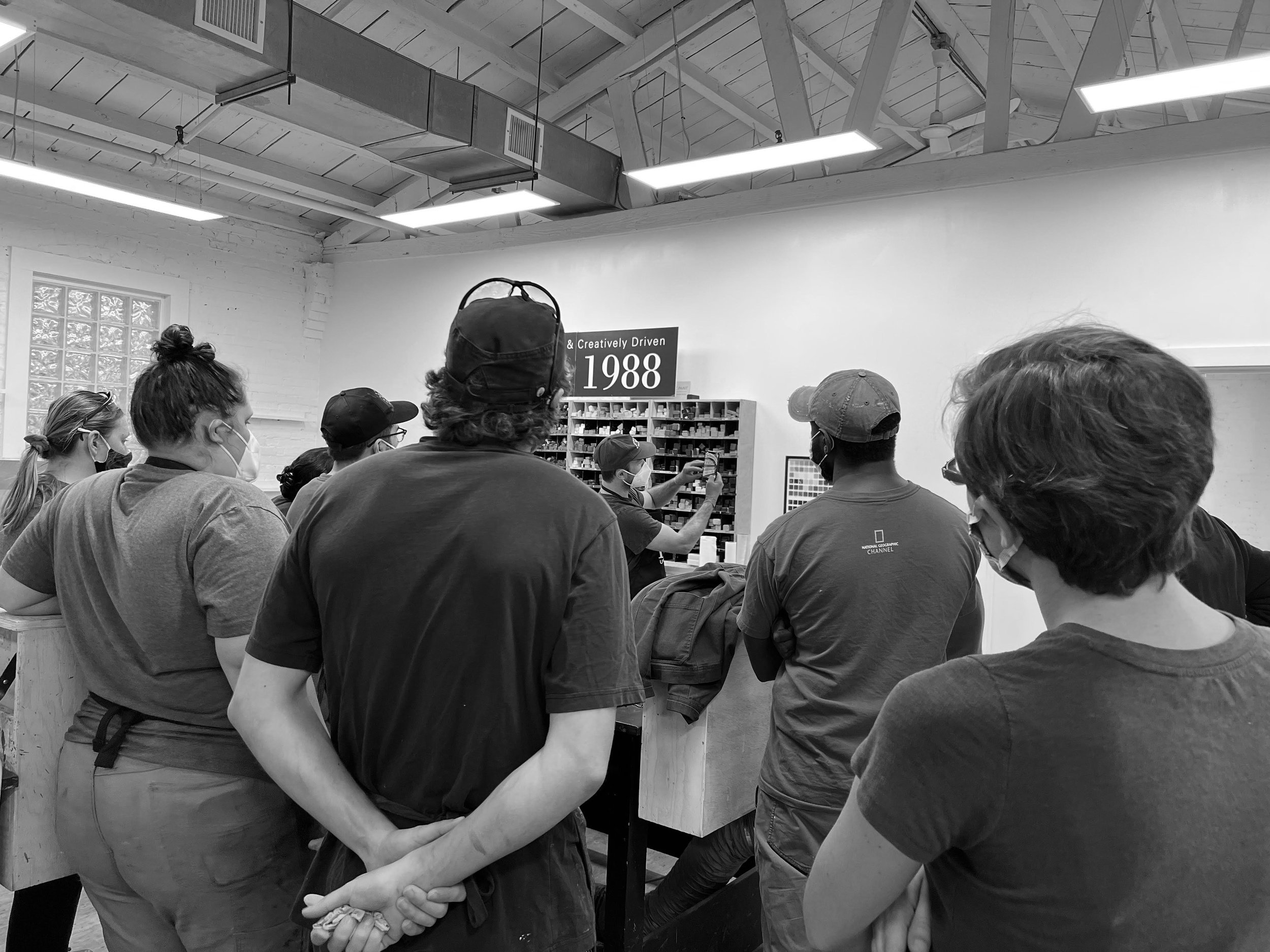
Notes on Color: Chromatic Tones
Recently we chatted with R&F founder Richard Frumess about the decision to make a Chromatic Tones Color Set in both our Pigment Stick and encaustic paint lines.
"Value plays a huge part in how chromatic whites operate. This an important part of color theory and helpful for students to understand. One way to demonstrate this is to start with black and white backgrounds, because they're the extremes of value, and then move on to how the chromatic whites play off stronger colors.”
So we did.
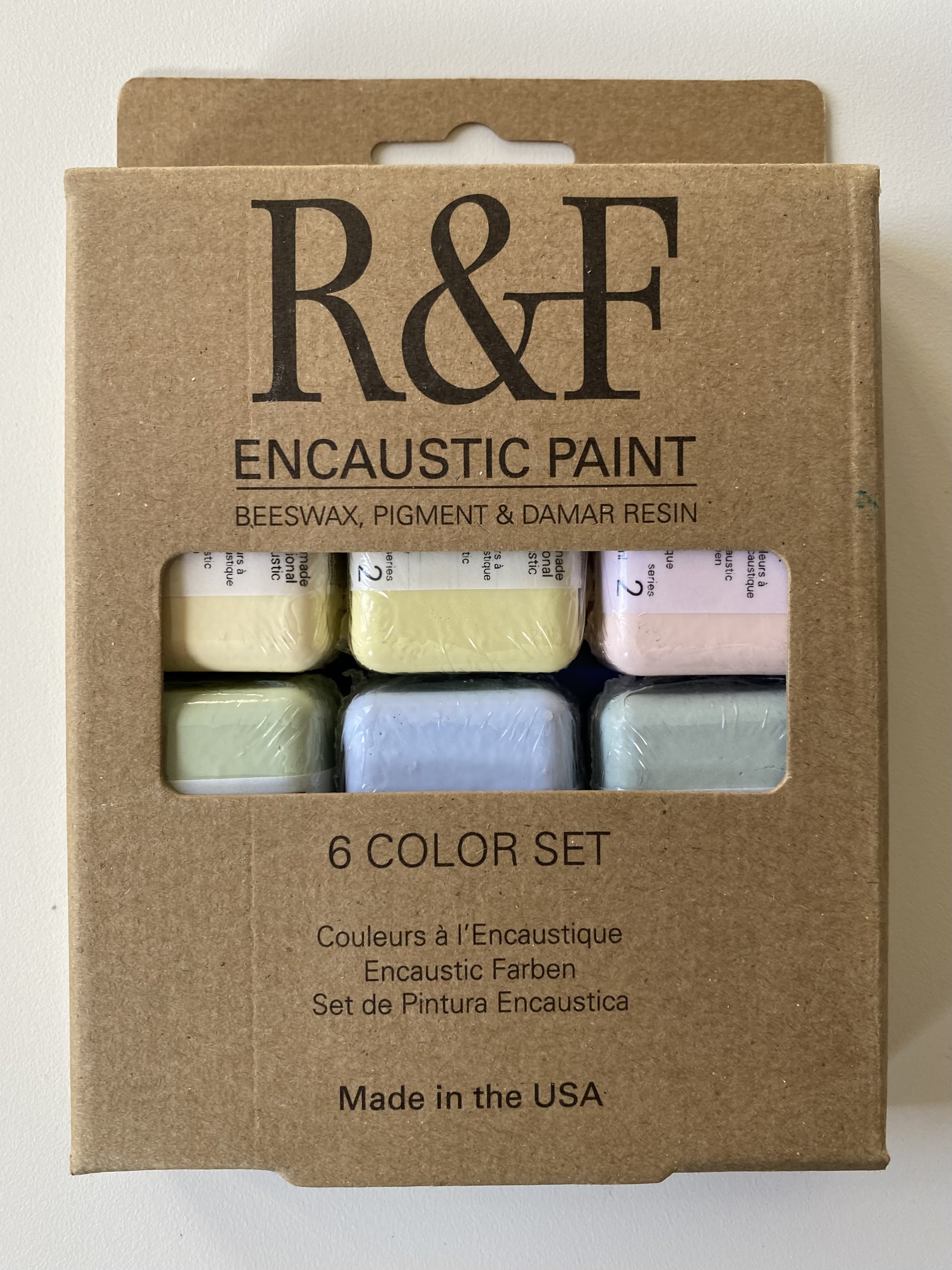
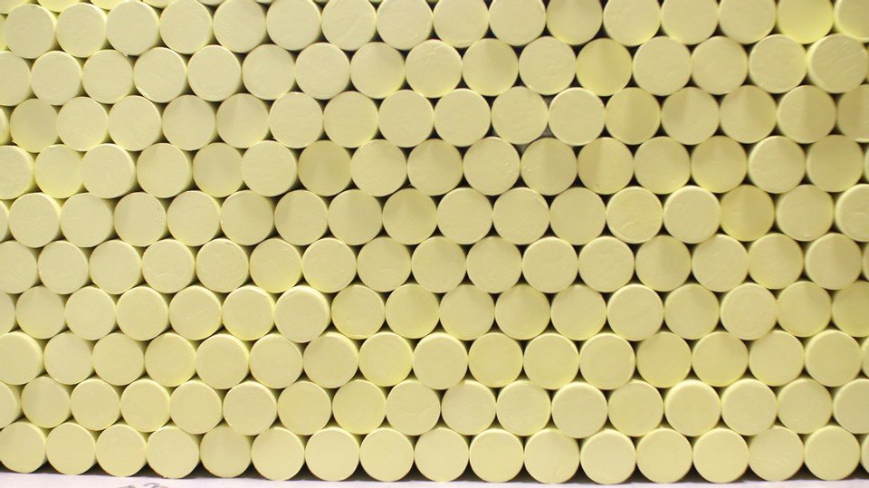
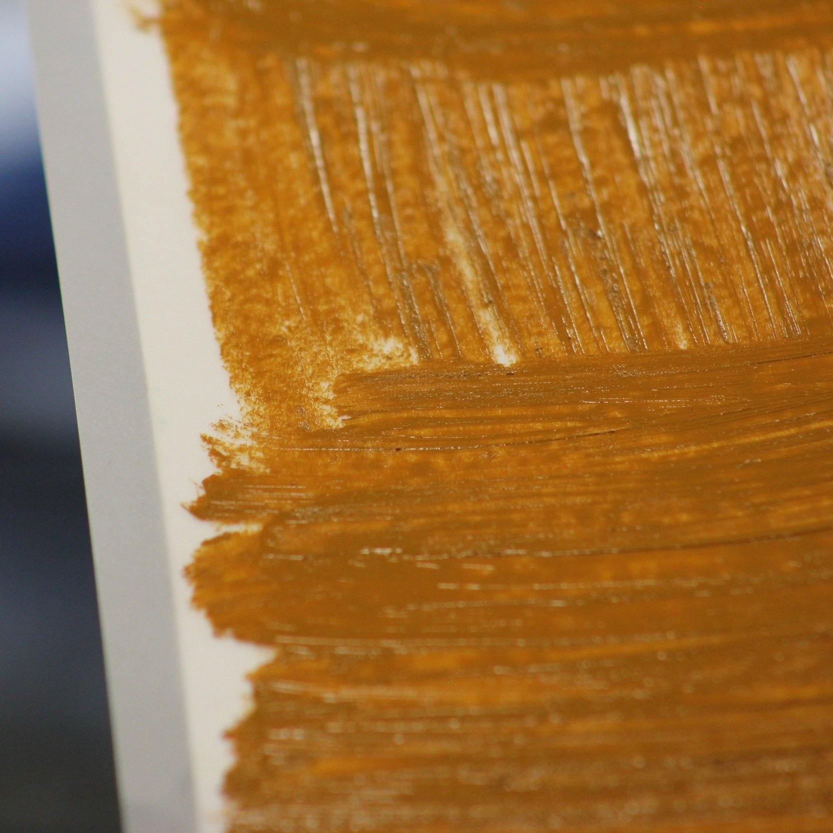
Our Chromatic Tones Color Set (for those unfamiliar) consists of of six tints in 40 ml cakes. It includes Brilliant Yellow Extra Pale, Celadon Green, Cerulean Grey, Green Gold Pale, Scarlet Extra Pale, and Ultramarine Blue Pale.
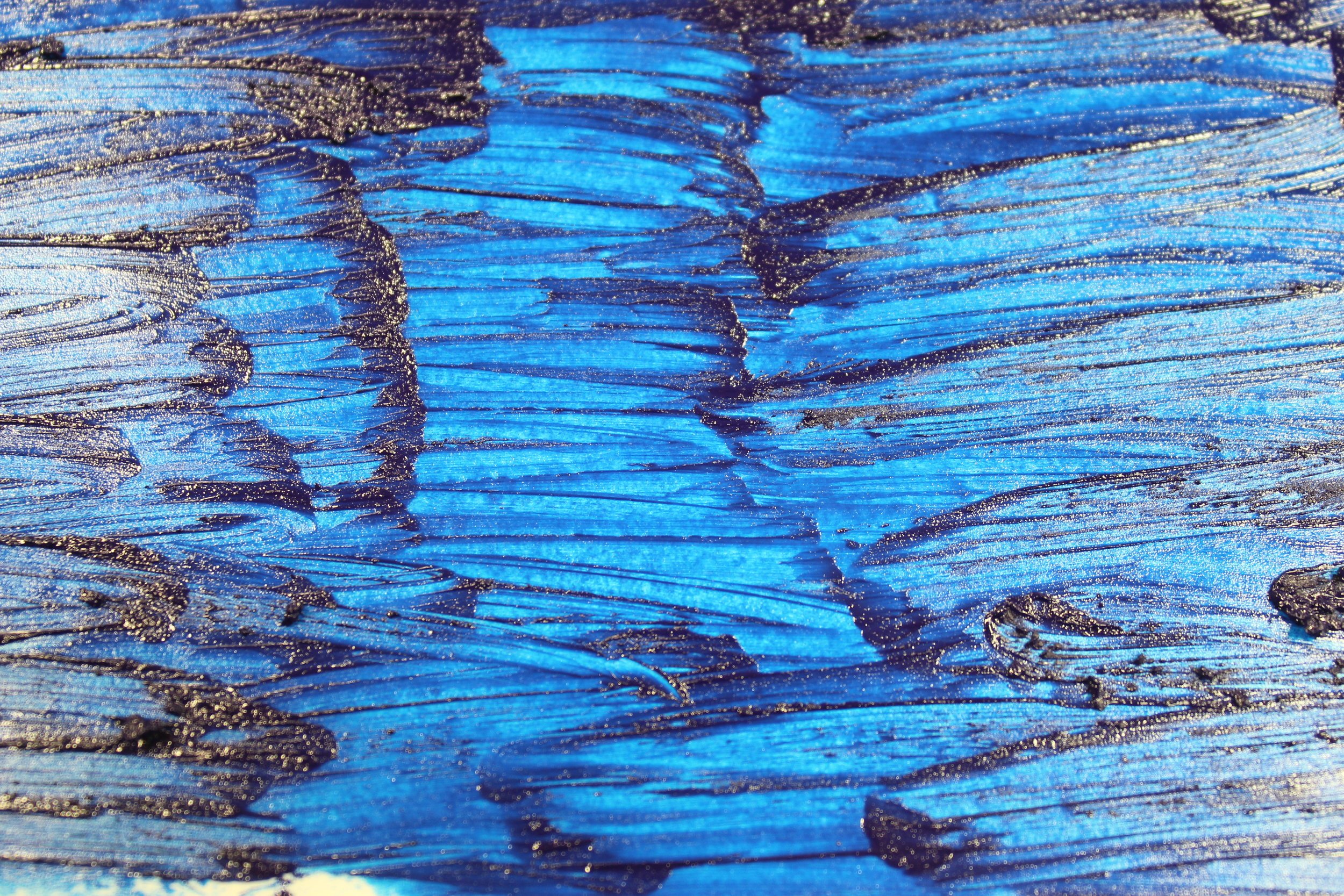
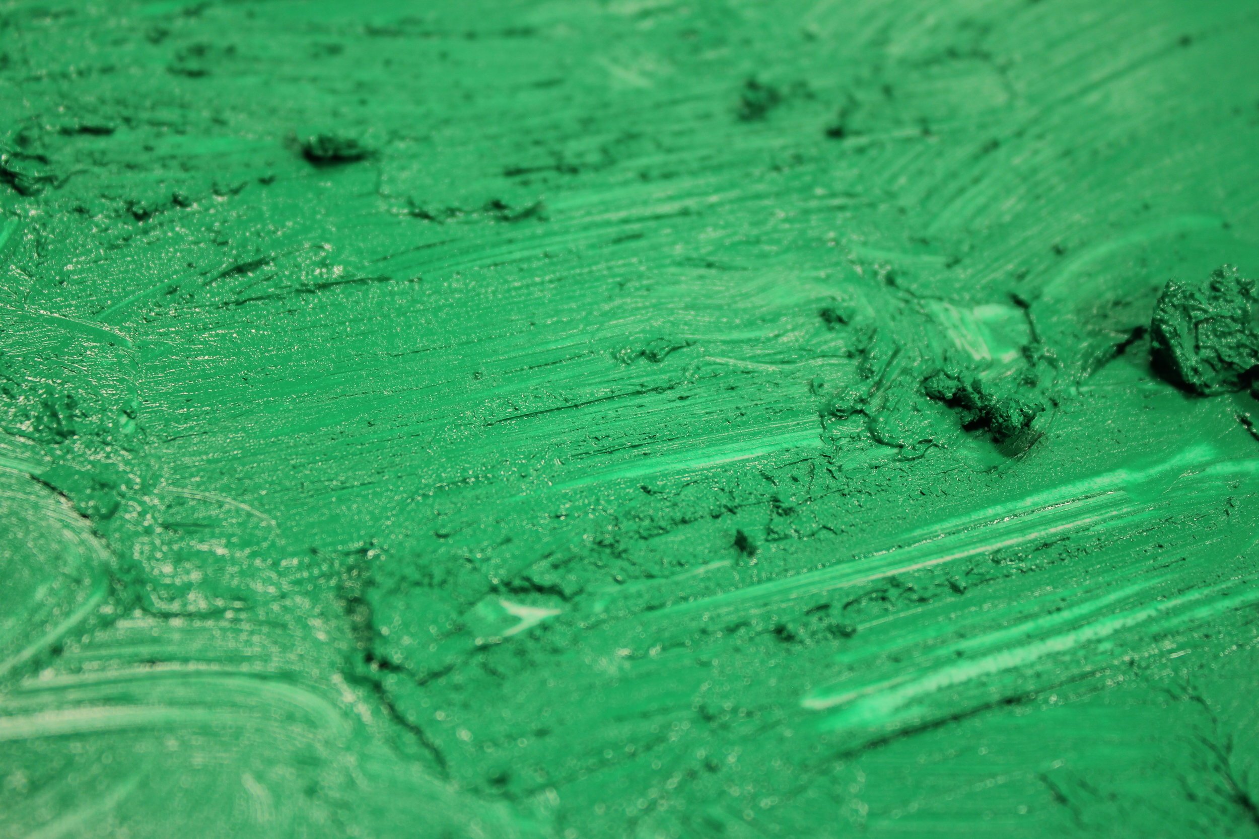
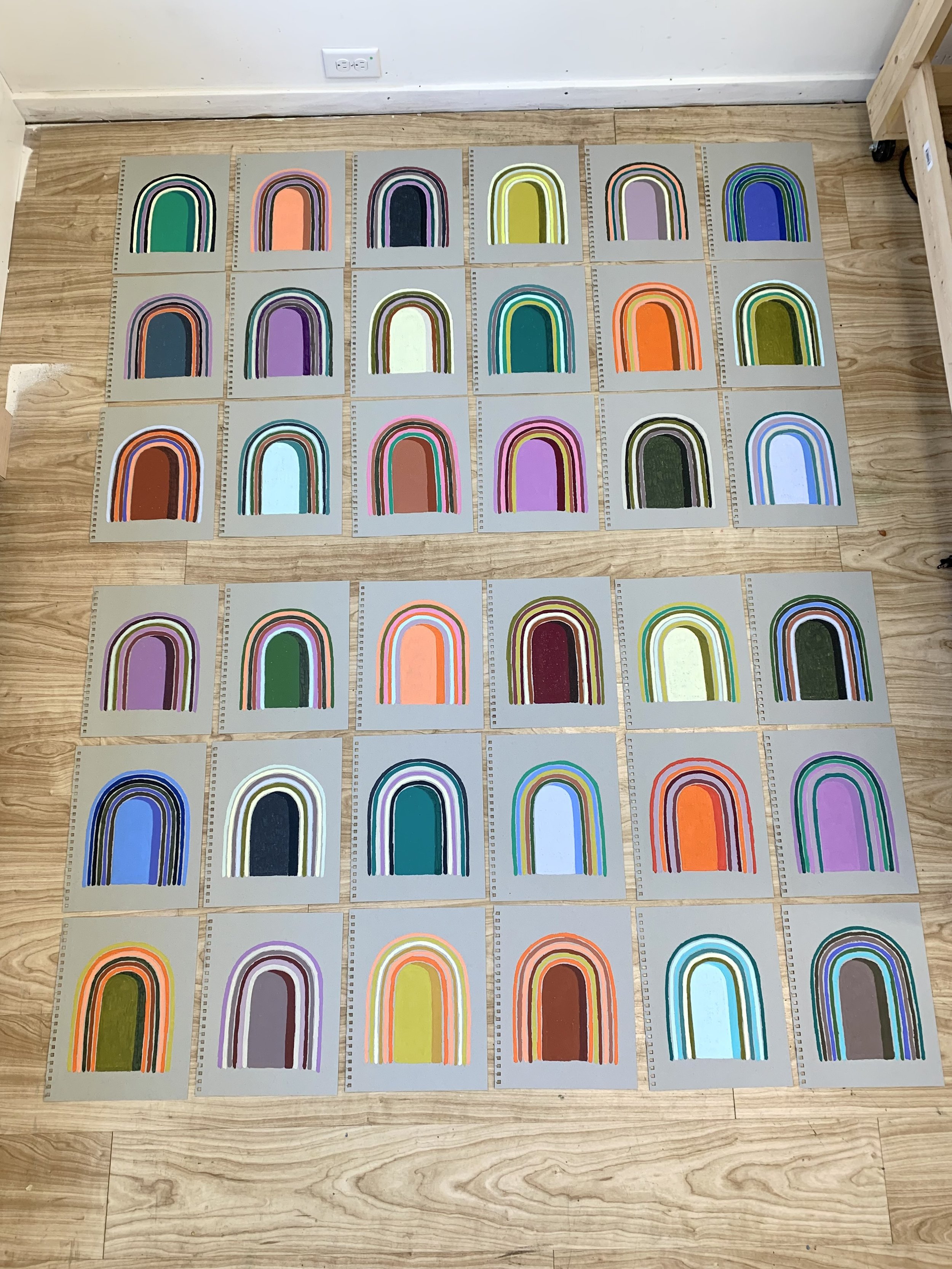
Placing a stroke of each of our our Chromatic Tones Color Set on black and white backgrounds shows the effect of achromatic value on chromatic whites.

From L to R: Cerulean Grey, Brilliant Yellow Extra Pale, Scarlet Extra Pale, Celadon Green, Ultramarine Blue Pale, and Green Gold Pale.
Try this for yourself. When you experiment, you will see that a white background, which will contrast less with a chromatic white, will make the chromatic white look darker and tend to bring out its color. It may also make it look slightly grayish. A black background will tend to bring out its whiteness.
Richard suggests you then take one step further on the black background and lay a brush stroke of Titanium White anywhere on the panel. This will have the effect of causing your chromatic white to stop looking so white and reveal its color.
The push and pull of color interaction adds another dimension to the effect of value. A quick way to see this is to do an experiment with Phthalo Green Pale.
Try laying a wide stroke down on a background of Chromium Oxide Green, Cadmium Yellow Light, Celadon, and Scarlet Extra Pale.

From L to R: Phthalo Green Pale encaustic paint on Chromium Oxide Green, Cadmium Yellow Light, Celadon, and Scarlet Extra Pale.
The Phthalo Green Pale appears lighter on Chromium Oxide Green because the very strong green of Chromium Oxide Green is pushing the weaker green of Phthalo Green Pale away from green.
Compare that to Phthalo Green Pale on Cadmium Yellow Light where the yellow pushes Phthalo Green Pale away from yellow toward blue. On Celadon and on Scarlet Extra Pale, there is very little contrast value, so the Celadon pushes the Phthalo Green Pale toward blue. Scarlet Extra Pale pushes the Phthalo Green Pale toward green in a more subtle fashion.
Below you will find a video demonstrating the differences in value produced by our Chromatic Tones Color Set. You can find all kinds of additional helpful content - from tips on color mixing to artist spotlights - neatly organized for you on Articles & Links, as well as over 18 demo videos hosted on our YouTube channel.
Enjoy. Keep painting.
What to learn more? Richard will be teaching two upcoming workshops on color.
3/23 - 25: What Makes Encaustic Different in Creating Color Effects? co-taught with Leslie Giuliani, R&F Handmade Paints, Kingston, NY
6/6 - 8: Solving Color Problems, Truro Center for the Arts at Castle Hill, Truro, MA
The 16th International Encaustic Conference
The 16th International Encaustic Conference hosted by Truro Center for the Arts will take place June 9 - 11th in Provincetown, Massachusetts. The conference is the place to be for anyone interested in encaustic. Instructors from across the country and around the world will be there offering talks and demos.
Artwork credit: R&F Core Instructor Julie Snidle. Julie will be teaching a post-conference workshop The Joy of a Limited Palette.
The 16th International Encaustic Conference hosted by Truro Center for the Arts will take place June 9 - 11th in Provincetown, Massachusetts. The conference is the place to be for anyone interested in encaustic. Instructors from across the country and around the world will be there offering talks and demos.
Pre and post conference hands-on workshops round out your immersive experience. There’s a hotel fair, a postcard show, giveaways, a book signing, a juried show, and - best of all - R&F will be in the vendor room with a full array of paint and materials.

Image credit: Michele Randall. Michele will be teaching a pre-conference workshop Cyanotype Printmaking & Encaustic Fusion.
Never been to the conference? This might be the year to go.
There will be 17 different talks at the conference including a range of topics from “Inventing Novel AIR Residencies” with R&F Artist Instructors Kelly Milukas and Bettina Egli Sennhauser, to “Artists Working With Textiles: Part 2” with Susan Lasch Krevitt, and “The Impact of Loss In Your Art” with Patti Russotti and R&F Core Instructor Lisa Pressman. Important professional development topics such as grant writing, marketing, packing and shipping encaustic will also be addressed.
Demos at the conference cover everything from the “Fundamentals of Getting Started” with Eliaichi Kimaro to “Intentional Content” with R&F Artist Instructor Kelly Williams and“Materiality and Encaustic: Re-Imaging the Substrate” with Janise Yntema. R&F Core Instructor Leslie Giuliani will be there to demo “Paper Lithography on Wax” and Stephanie Hargrave will present “Encaustic Assemblage, Multiples, and Meaning” with Stephanie Hargrave. Shary Bartlett will demo “Luscious Lines: Tools For Texture.”

Artwork credit: R&F Artist Instructor Kelly Williams. Kelly will be teaching a post-conference workshop Intentional Content.
This year’s conference Keynote Speaker is Hrag Vartanian.
The editor-in-chief and co-founder of Hyperallergic, Hrag Vartanian is an art critic, curator, artist, and lecturer on contemporary art with an expertise on the intersection of art and politics.
Hyperallergic reaches an audience of over a million people a month. Some of Hrag’s notable essays from the past few years include the forward to The Artist as Culture Producer, which is titled “Imagining the Future Before Us,” his keynote at the American Craft Council’s 2019 national conference, and his criticism of “Tribute in Light.”
Can’t attend the conference but are interested in one of the workshops? Don’t worry! It is not necessary that you attend the conference in order to register for a pre- or post-conference workshop.

Image credit: R&F Core Instructor Lisa Pressman. Lisa will be teaching a post-conference workshop 100 Pieces In 3 Days? Loosen Up and Let Go.
Pre-Conference workshops include:
6/5 - 6/6: Layer by Layer: Monotype Collage and Encaustic with Debra Claffey
6/5 - 6/6: Cyanotype Printmaking & Encaustic Fusion with Michele Randall
6/6 - 6/8: Organic Abstraction with Values and Color taught by Kelly Milukas
6/6 - 6/8: Solving Color Problems with R&F founder Richard Frumess
6/6 - 6/8: Encaustic + Paper: Collage, Dip, Monoprint with Dietlind Vander Schaaf
6/7 - 6/8: Encaustic with Alternative Surfaces with Jodi Reeb
6/7 - 6/8: Solving Common Problems Faced By Painters Using Encaustic with Dale O. Roberts
6/7 - 6/8: Paper Lithography On Wax with Leslie Giuliani
6/7 - 6/8: What They Didn’t Teach You In Art School with Kim Bernard
6/7 - 6/8: Silkscreen Monoprint with Encaustic with Jeff Hirst
6/8: Getting Started with Encaustic Painting by Eliaichi Kimaro

Image credit: R&F Core Instructor Leslie Giuliani. Leslie will be teaching a pre-conference workshop Paper Lithography On Wax.
Post-Conference workshops include:
6/12 - 6/13: The Joy of a Limited Palette with Julie Snidle
6/12 - 6/13: Material World: Transforming Fabric & Wax! with Susan Lasch Krevitt
6/12 - 6/13: 100 Pieces In 3 Days? Loosen Up and Let Go with Lisa Pressman

Artwork credit: R&F Artist Instructor Debra Claffey. Deb will be teaching a pre-conference workshop Layer by Layer: Monotype Collage and Encaustic.
6/12: Using Procreate for Editing Artworks with Anna Wagner-Ott
6/12 - 6/14: Encaustic, Assemblage, Multiples & Meaning with Stephanie Hargrave
6/12 - 6/14: Photographs, Transfer Film, and Encaustic with Patti Russotti
6/12 - 6/14: Encaustic Meets Fresco with Bettina Egli Sennhauser
6/13: Zen Painting with Gabriela Sanchez
6/13: Shine! Presenting Your Work and Yourself to the World with Joanne Mattera
6/14 - 6/15: Materiality and Encaustic: Re-Imagining the Substrate with Janise Yntema
6/14: Intentional Content with Kelly Williams
Artwork credit: R&F Core Instructor Jeff Hirst. Jeff will be teaching a pre-conference workshop Silkscreen Monoprint with Encaustic.
To view a complete list of pre and post conference workshops and to register for the conference, visit castlehill.org.
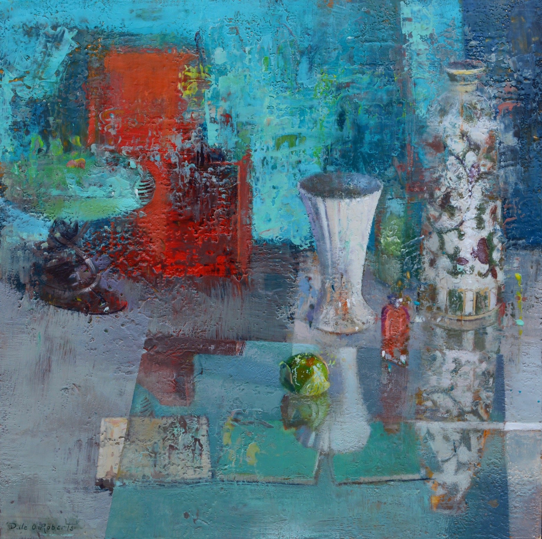
Artist Spotlight: Dale O. Roberts
Dale O. Roberts graduated Cum Laude with a B.F.A. in Painting and Drawing from Tyler School of Art in 1982. His work has been shown at Gross McCleaf Gallery, Blue Heron Gallery, the Marshall Gallery, Church Street Gallery, and Art Nou Mil-Lenni Gallery in Barcelona, Spain, among others. Dale’s paintings have appeared in magazines and other publications and are in many private collections, including University of Pennsylvania Hospital, Fidelity Bank of Delaware, PECO, Cozen O’Connor Law Firm, Vanguard Investment Group, and Rutgers University Museum.

Dale O. Roberts, Building(s), encaustic on panel, 36” x 48”.
Dale O. Roberts graduated Cum Laude with a B.F.A. in Painting and Drawing from Tyler School of Art in 1982. His work has been shown at Gross McCleaf Gallery, Blue Heron Gallery, the Marshall Gallery, Church Street Gallery, and Art Nou Mil-Lenni Gallery in Barcelona, Spain, among others. Dale’s paintings have appeared in magazines and other publications and are in many private collections, including University of Pennsylvania Hospital, Fidelity Bank of Delaware, PECO, Cozen O’Connor Law Firm, Vanguard Investment Group, and Rutgers University Museum.
Dale paints with encaustic, as well as gouache, watercolor, oil, and other mediums. His process involves numerous preparatory drawings, color studies, reworking, and substantial reliance on memory. Often he brings a panel to a site to indicate proportion, point of view and scale concerns.
In addition to serving as an adjunct professor at Arcadia University, Dale has taught workshops at the International Encaustic Conference, The Encaustic Center, and the Federation of Canadian Artists in Calgary, Canada. He and his wife have two sons and live just outside of Philadelphia with their Springer Spaniel, Remy.

Can you tell us a little about yourself? How did you get your start as an artist?
I grew up in Upstate New York, where the farming community had no clue that you could make a living as an artist, and yet I was interested in art from a very young age. I started drawing when I was around five and began to paint around seven. I spent a lot of time drawing from life. Landscapes were a primary interest, as well as animals and later figure work. After art school, I began to see what was possible: I was exposed to the work of wonderful painters and teachers who allowed me to grasp that someone could actually make an art life work.

Dale O. Roberts, Flotsam, encaustic on panel, 16.5” x 14.5”.
What are you currently working on in the studio? How has your work evolved over the years?
Currently, my work seems focused on the ways we perceive the world around us, particularly in landscapes and cityscapes. Using sketches done from life and some alchemy in the studio, my process is ultimately about the paint, what is there, asking “How do I react to what’s there?” and the dynamic relationship between the paint and the panel in front of me.

Dale O. Roberts, Arches on Arch, encaustic on panel.
You will be teaching Creative Approaches To Painting Encaustic From Life October 5 - 7. What does this workshops focus on and what can students expect to leave with?
The workshop will be about pushing our own self-made boundaries in painting. It is about how to think, not what to think–freedom over formula. I have been experimenting with encaustic for about forty years, and I have discovered that I am not interested in writing a rulebook on how to use encaustic. Instead, I’m interested in cultivating a restless nature: a refusal to be satisfied with one technique of creating.
Although I do work from life and sketches, I am quite willing to pivot radically. Sometimes this means rounds of editing, or massively altering a work. Other times, this means paying attention to the paint itself. I believe my students come away with this empowerment: that they can approach their work in a way they did not consider before or even think possible. It is my hope that they will grow in a sense of abandon and freedom, holding to the idea that they can approach something that seems daunting, and find their way through.

Dale O. Roberts, The Cycles of Amsterdam, encaustic on panel, 36” x 42”.
What keeps you motivated in the studio? What is your typical studio day like? What's next on your horizon?
What keeps me motivated are folks like Rembrandt, Vermeer, and van Eyck and their towering achievements. Some of the modern painters, too, inspire me. Lately I’ve been looking at Hans Hoffman, Giacometti, Antonio Lopez Garcia – people that also paint from life but are free in their experimentation. Second, what keeps me motivated is that sense of exploration, as opposed to “arriving,” and always aiming for a result that will move the viewer.
Dale O. Roberts, Lost Edges, encaustic on panel, 23” x 23”.
These days, I am painting by 4:30 or 5 in the morning. I’ll work for a few hours, then eat breakfast and continue out in the studio. Midday, I take a run or walk my dog, to clear my head and move. In the afternoon, I paint again for up to 7 hours, and then I’ll spend time with my family. We enjoy cooking together and have a dog we love. I do a ton of reading. I am grateful for opportunities to help someone in need or assist with family or friends’ house project, and am glad to prioritize those times over anything else.
Anything else you'd like our readers to know?
I would like folks considering taking this workshop to realize that unless you try and are willing to dig deep and address problems, you will not develop as a painter. There is power in someone’s eagerness to take risks. This means trying methods that are outside your comfort zone. This also means broadening your range of inspirations, so your work is not so pigeonholed.
Keep your eyes open to the world around you. If you study with me, you will hear me say that anything we create is going to be a reflection on that world – there is nothing that we are making: a priori, it has already been made. When we paint, we are editors, borrowing from what is already there. Keeping our eyes open is how we learn from wonder and mystery.
To learn more about Dale and see additional images of his work, visit dalerobertsencaustic.com. You can also follow him on Instagram @dalerobertsencaustic or subscribe to his YouTube channel.
To register for Creative Approaches To Painting Encaustic From Life, visit rfpaints.com/workshops.
Meet The Team: Sean Sullivan
It’s time for another edition of "Meet The Team." This ongoing feature is our way of introducing you to the fine folks behind the scenes who make R&F possible - from the people answering the phones and scheduling workshops to the paintmakers themselves.

Sean Sullivan, Ascension (New Mnemonics No. 1), oil on found paper, 10.25 x 6.75 in (26.03 x 17.14 cm), 2020. Image courtesy of Chris Sharp Gallery.

It’s time for another edition of "Meet The Team." This ongoing feature is our way of introducing you to the fine folks behind the scenes who make R&F possible - from the people answering the phones and scheduling workshops to the paintmakers themselves.
This week we would like to introduce you to Sean Sullivan. Sean has been with R&F for going on sixteen years. In 2022, he became co-owner of R&F. Sean is an invaluable part of our team. An incredibly talented artist in his own right, he is also one of the nicest guys around.
To see more of Sean’s work, follow him on Instagram @parade.pimlico.pearl or visit his website parade-pentimento-pimlico-pearl.com.

Sean Sullivan, Sento, oil on found paper, 10.25 x 7 in (26 x 17.7 cm), 2021. Image courtesy of Chris Sharp Gallery.
Please provide a brief description of what you do day to day at R&F.
My day-to-day is mostly rooted in R&F operations: production, purchasing, staff, as well as creative direction.
As announced in October of 2022, after many years as a Paint Maker and Production Manager, I became one of the owners of R&F alongside Darin Seim, a reality and perspective shift I’m still processing, to be honest.
Richard Frumess (R&F’s founder) handed off a unique formulation to Darin and me. It is comprised of paint-making knowledge, passion, and a perspective that places a very high value on being an artist, on laughter, and most especially, on relationships. I am grateful to both of them and really excited to work with Darin to help imagine the future of R&F. As far as we’re concerned we have the best crew in the world and the products, well, we believe they speak for themselves.
How many years have you been working for R&F?
I started as a paint maker back in 2007 and became the Production Manager a few years later, maybe in 2010, or 2011?

Sean Sullivan, Ekphrastic Monastic, oil on found paper, 6.75 x 8 in (17.14 x 20.32 cm), 2021. Image courtesy of Chris Sharp Gallery.
What do you do outside of work? Do you have an art background or related practice?
My partner, Marie, and I have been together for 28 years, I love coming to work, but I also love going home! We have two boys, Emmett, age 11, and Hugh, age 8, and a dog named Hobbes. They keep us pretty busy. I do my best to maintain a studio practice, usually a few hours a week, after dinner, before bed kinda thing, and on the weekends mostly.
If someone came to visit Kingston, what's one thing you would recommend they see, do, eat, or experience?
I'll give you two! I would recommend eating at The Tortilla Taco Bar, followed by a walk on the new Empire State Trail.

Sean Sullivan, Epistolic epistomology, oil on Kitikata, 10.25 x 8 in (26 x 20.32 cm), 2021. Image courtesy of Chris Sharp Gallery.

Sean Sullivan, Love of Labor, oil on found paper, 10.25 x 6.75 in (26.03 x 17.14 cm), 2021. Image courtesy of Chris Sharp Gallery.
Favorite color in R&F’s color line?
Just one? That's impossible!
Current top five: Warm Pink, Veronese Green, Burnt Sienna, Turkey Umber Pale, and King's Blue. You should also see what we’re cooking up for the future, soooo exciting…
Notes on Color: Translucent Color Set
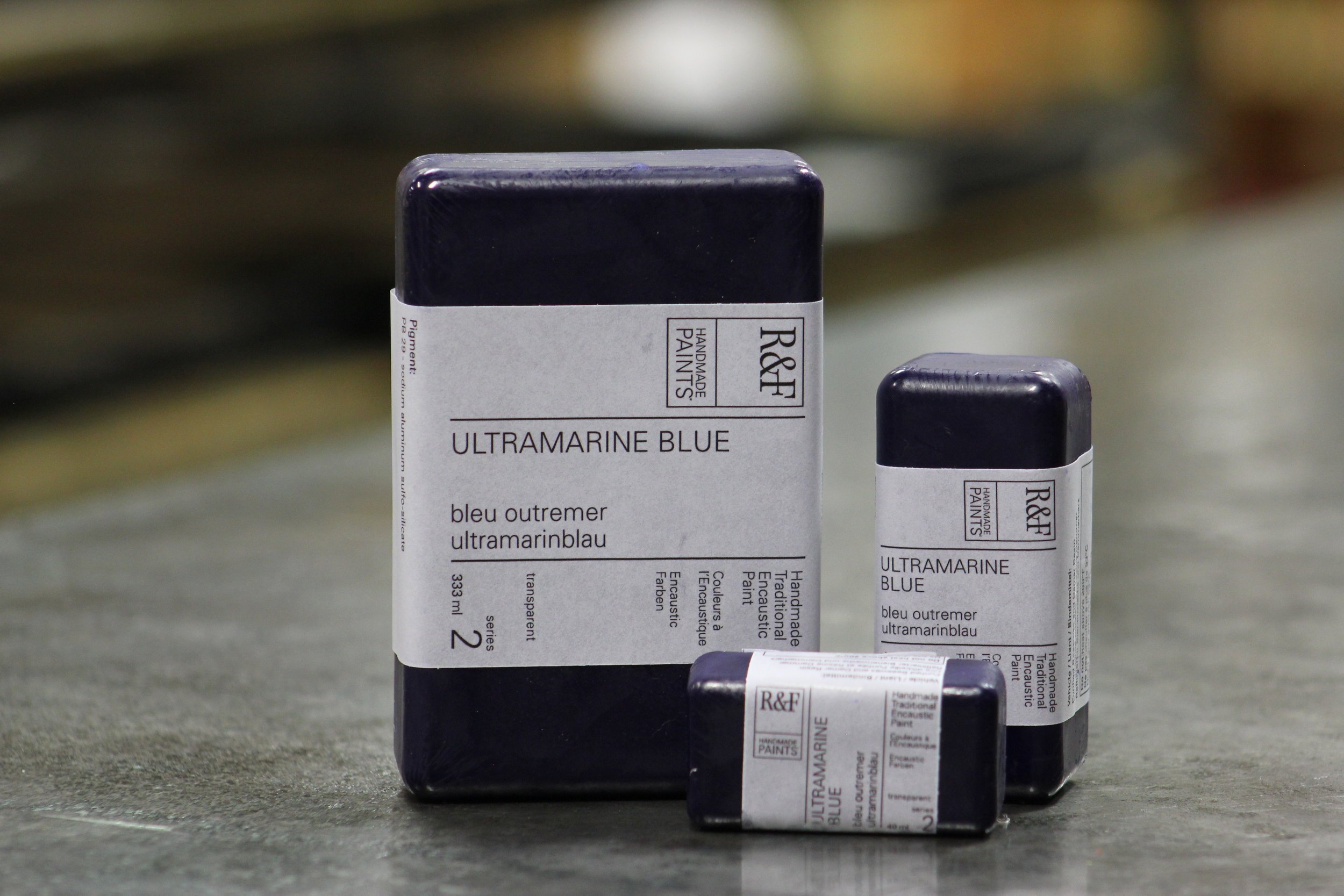
Welcome to another edition of Notes On Color. This week we are highlighting our Translucent Color Set. A sweet set of six jewel-tone 40ml encaustic paints, R&F's Translucent Color Set includes Alizarin Crimson, Alizarin Orange, Indian Yellow, Viridian, Ultramarine Blue, and Egyptian Violet. It comes packaged in a cradled 6" x 6" Ampersand Encausticbord™ panel so you are ready to paint.

Welcome to another edition of Notes On Color. This week we are highlighting our Translucent Color Set.
A sweet set of six jewel-tone 40ml encaustic paints, R&F's Translucent Color Set includes Alizarin Crimson, Alizarin Orange, Indian Yellow, Viridian, Ultramarine Blue, and Egyptian Violet. It comes packaged in a cradled 6" x 6" Ampersand Encausticbord™ panel so you are ready to paint.
Richly pigmented, these six encaustic paints can be extended with encaustic medium to create luminous glazes. Add some Titanium White to produce vibrant tints. Below you will find a video demonstrating the range of colors you can create with this set.
And remember you can find all kinds of helpful content - from tips on color mixing to artist spotlights - neatly organized for you on Articles & Links, as well as over 18 demo videos hosted on our YouTube channel.
Enjoy. Keep painting.
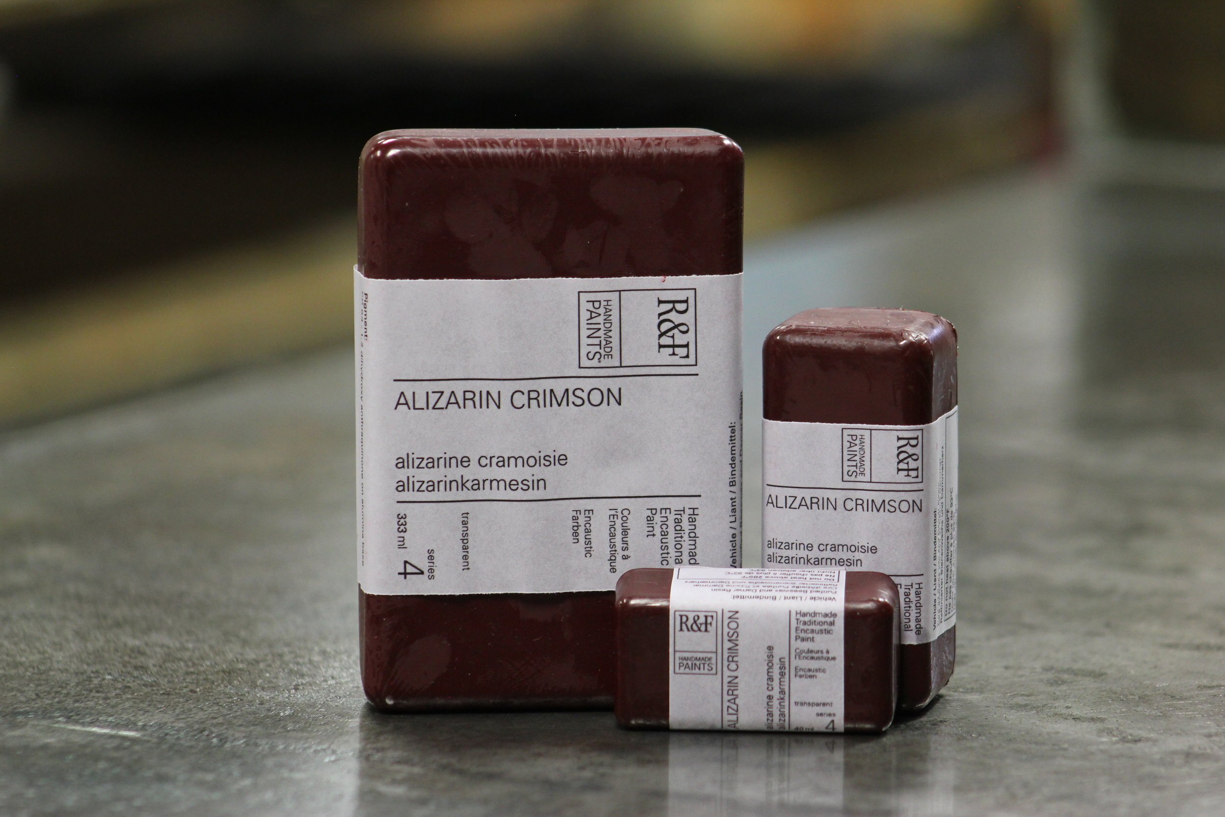
ALIZARIN CRIMSON. Hard to mill without using stearate additives. We don't use them because stearates dull the color. Our milling is difficult and tricky, but the result is pure, luminous ruby-red undertone. Less harsh than Quinacridones.
Available in both our encaustic and Pigment Stick® color lines. Transparent with a slow Pigment Stick® drying rate.
Chemical Composition: 1, 2 dihydroxy anthraquinone on alumina base.


ALIZARIN ORANGE. A translucent color with a muted orange mass tone that is between cadmium and mars orange. But its undertone is a surprising fiery orange-yellow that becomes lemony when extended out.
Available in both our encaustic and Pigment Stick® color lines. Transparent with a slow Pigment Stick® drying rate.
Chemical Composition: disazo pigment, anthraquinone pigment.


INDIAN YELLOW. A deep rich translucent yellow. The original Indian Yellow came from India. It was processed from cow’s urine and used in Europe in the 18th and 19th centuries for watercolor. It was fugitive in oil. The modern version has the same warm tones as the original.
Available in both our encaustic and Pigment Stick® color lines. Transparent with a slow Pigment Stick® drying rate.
Chemical Composition: disazo pigment.
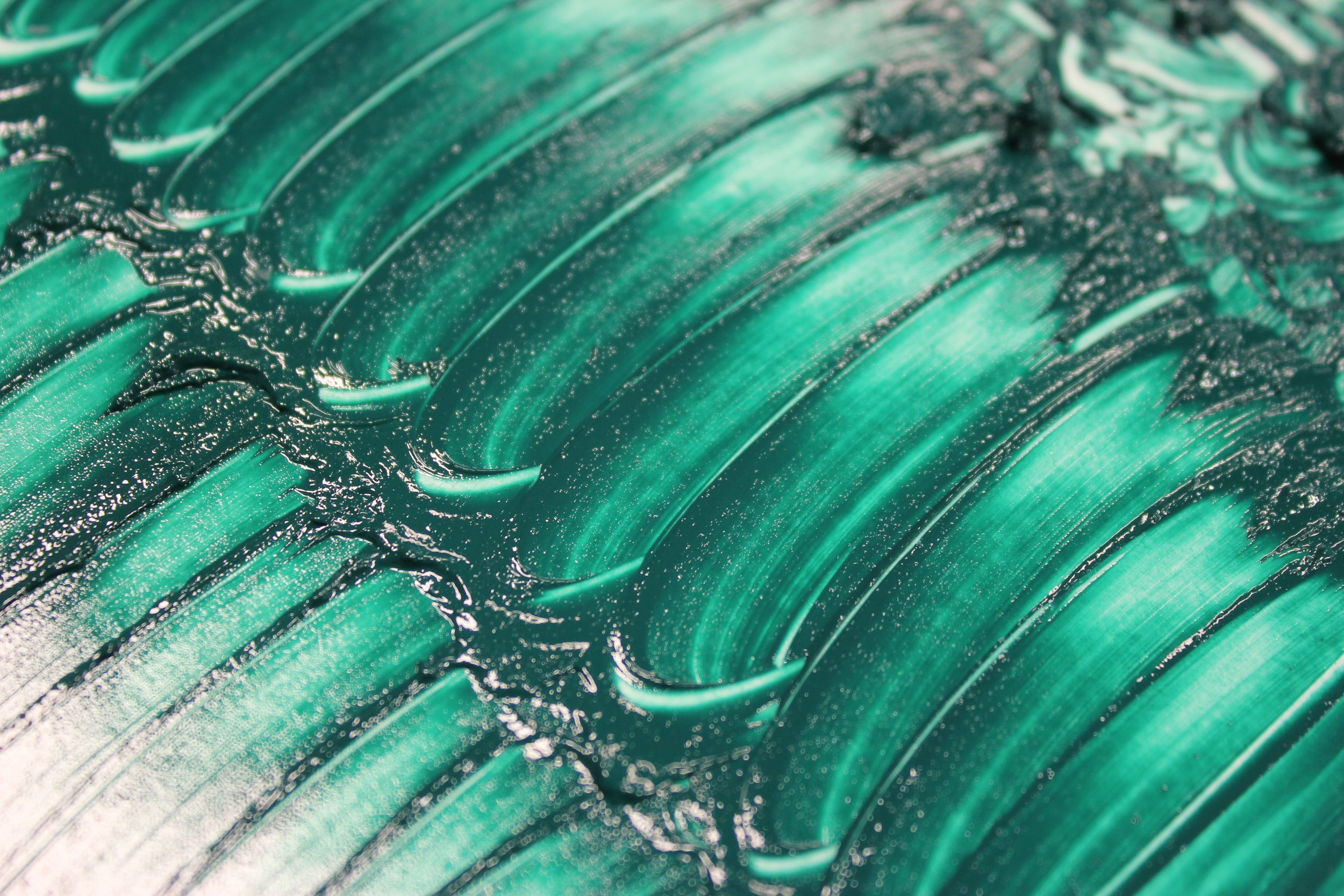
VIRIDIAN. Emerald undertone. Softer, slightly yellower, and slightly less transparent than Phthalo. Beautiful glaze color. Also known as Vert Emeraude and Guinet's Green.
Available in both our encaustic and Pigment Stick® color lines. Semi-Transparent with a fast Pigment Stick® drying rate.
Chemical Composition: hydrated chromium sesquioxide.


ULTRAMARINE BLUE. The reddest, deepest Ultramarine we could find. Beautiful glazing color.
Available in both our encaustic and Pigment Stick® color lines. Transparent with a medium Pigment Stick® drying rate.
Chemical Composition: sodium aluminum sulfo-silicate.
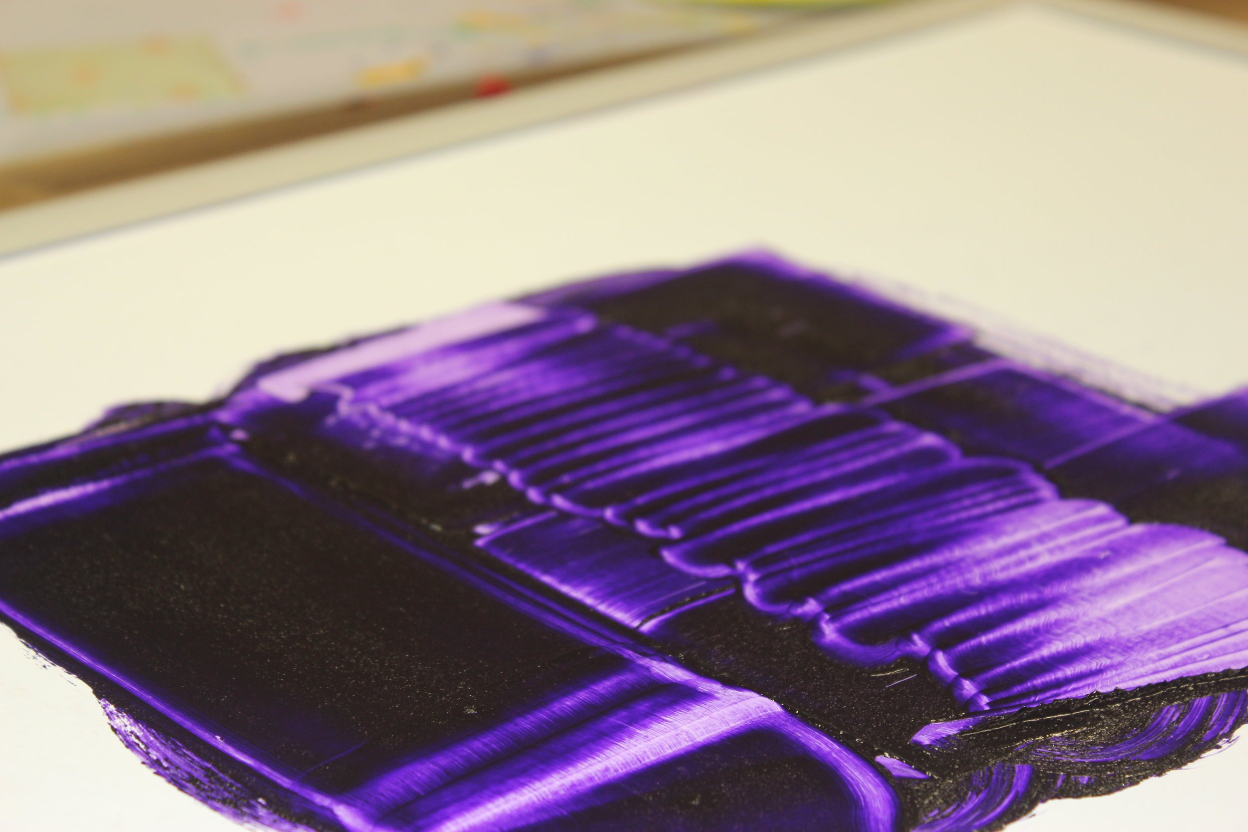
EGYPTIAN VIOLET. The strongest of our violets, perhaps even more intense than the Phthalos. Very bluish undertone, like Ultramarine Violet, but with a very dark top tone that is almost blackish.
Available in both our encaustic and Pigment Stick® color lines. Transparent with a slow Pigment Stick® drying rate.
Chemical Composition: dioxazine pigment.

Notes on Color: The Phthalos
We’re back with another edition of Notes On Color - our platform for sharing our thoughts on color. Meet Phthalo Blue, Phthalo Turquoise, and Phthalo Green. Don’t be fooled by their dark top tones. These colors pack a punch.

We’re back with another edition of Notes On Color - our platform for sharing our thoughts on color. Meet Phthalo Blue, Phthalo Turquoise, and Phthalo Green. Don’t be fooled by their dark top tones. These colors pack a punch.
Richly pigmented, our encaustic paints can be extended with encaustic medium to create luminous glazes. Add some Titanium White to produce vibrant tints. The same can be done with our Pigment Sticks® using R&F Blending Medium.
Scroll down to find a short demo video illustrating how to work with our phthalos.
And remember you can find all kinds of helpful content - from tips on color mixing to artist spotlights - neatly organized for you on Articles & Links, as well as over 18 demo videos hosted on our YouTube channel.
Enjoy. Keep painting.
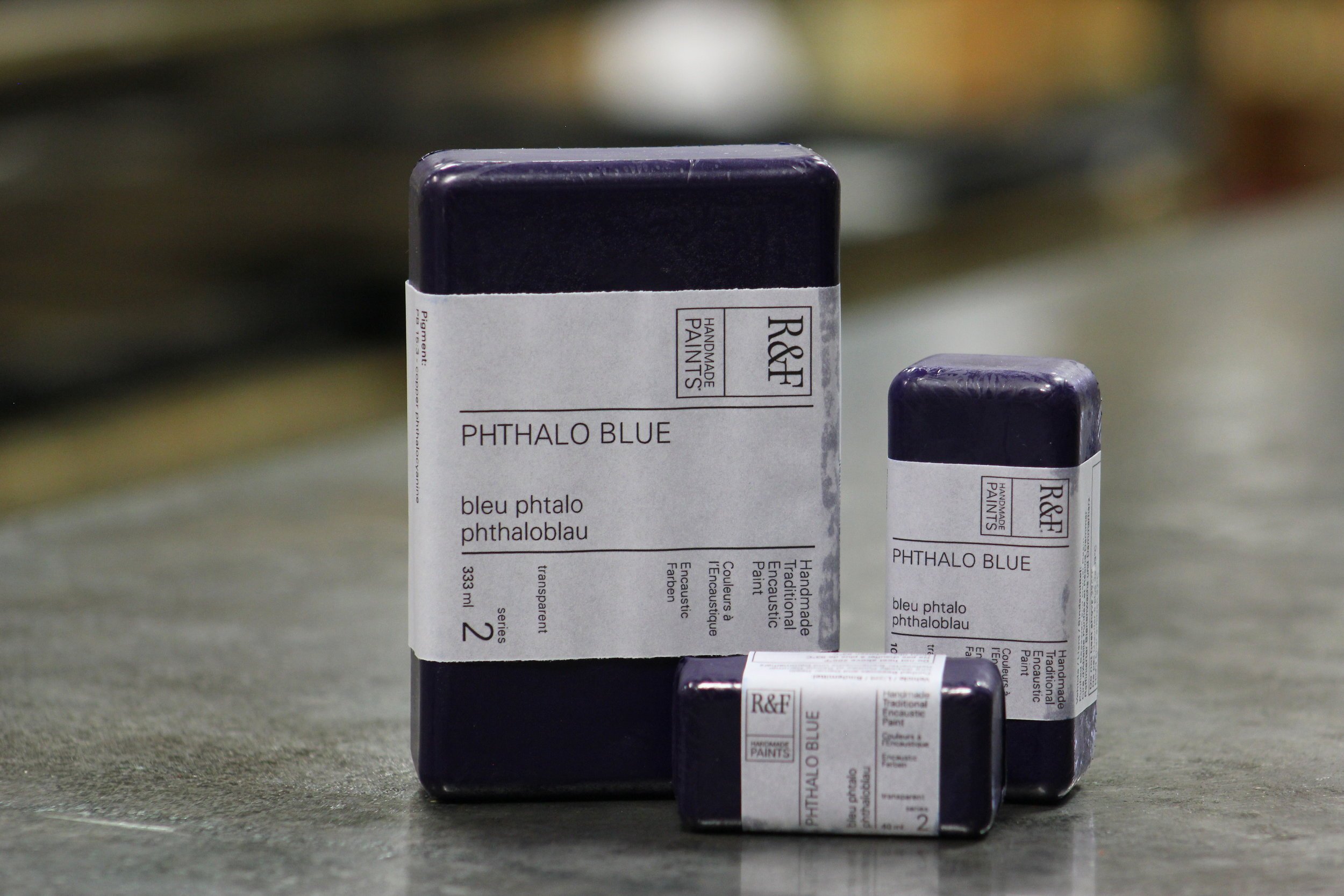
PHTHALO BLUE. Very powerful, makes for a bright clean tint. Greener than our Ultramarine and Cobalt Blues.
Available in both our encaustic and Pigment Stick® color lines. Transparent with a Pigment Stick® drying rate of medium.
Chemical Composition: copper phthalocyanine.

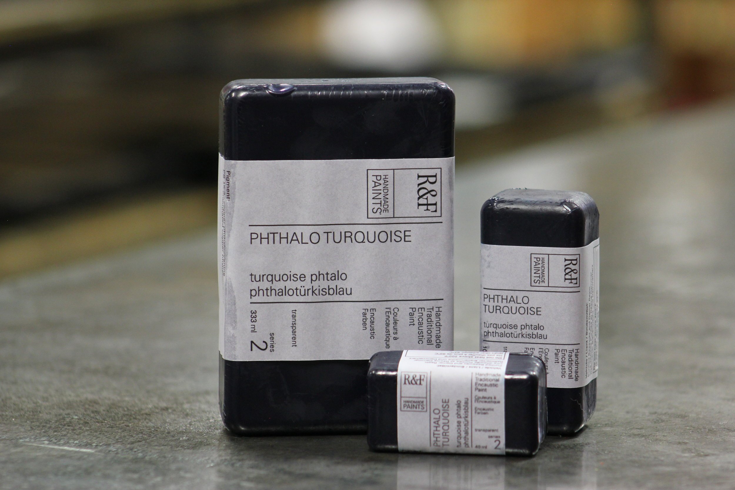
PHTHALO TURQUOISE. With a vivid turquoise undertone, Phthalo Turquoise has a hue midway between Phthalo Blue and Phthalo Green.
Available in both our encaustic and Pigment Stick® color lines. Transparent with a Pigment Stick® drying rate of medium.
Chemical Composition: phthalo blue + phthalo green.


PHTHALO GREEN. Very powerful and deep. In line work it can look blacker than black. Possessing a vivid undertone, Phthalo Green can be a bit harsh, but it makes for an excellent glaze.
Available in both our encaustic and Pigment Stick® color lines. Transparent with a Pigment Stick® drying rate of medium.
Chemical Composition: chlorinated copper phthalocyanine.
R&F's 2023 Artists-In-Residence: Brad Ellis, Henry Curchod & Kuzana Ogg
Competition for our three artist residencies at Brown Pink this year was tough. With nearly 100 submissions, the panel of anonymous jurors had their work cut out for them. Thank you to all the artists who applied. We will open applications again next fall for 2024.
We’d like to introduce you to our 2023 Artists-In-Residence: Brad Ellis, Henry Curchod, and Kuzana Ogg. We are honored to welcome these talented artists to Brown Pink for a two week residency and look forward to seeing what they make.

Brad Ellis
Brad Ellis is a mid-career, Texas-based artist whose focus is on abstract painting. Throughout his career he has continually experimented with imagery from tightly rendered, systematic patterns to loosely constructed, expressionistic compositions.
For Brad, the pure physicality of encaustic paint combined with various collage elements render distinct textures and surface treatments that energize his abstract imagery with movement and excitement.
Brad earned his BFA from the University of Tulsa and his work is represented by art galleries across the country from Boston to Bellevue. His paintings are included in private and corporate art collections, including the U.S. State Department’s Art In Embassies Program in Kampala, Uganda. He is featured in both Texas Abstract, Modern + Contemporary and Encaustic Art In The Twenty-First Century. bradellisart.com

Brad Ellis, Black Trellis #2, 60” x 48”, encaustic, enamel, ink and collage on board, 2021
Henry Curchod
Henry Curchod, who currently resides in the UK, works primarily in painting and sculpture. He describes his work as “broadly resolv(ing) false histories in my life; using narrative to explore historical negationism on both a personal and global level, as well as symbols and themes that cross my Western upbringing and Iranian heritage.”

Working with dry pigments, charcoal, and oil stick on raw linen, Henry builds up layers in a hyper-physical approach to mark making, allowing a narrative and atmosphere to emerge over a period of time. He attempts to retain the aesthetic quality of ancient Persian miniature paintings on a large scale, maintaining reverence to the surface of the canvas, but focused on contemporary subject matter.
Exploring themes of hierarchy, brutality, persecution, capitalism, cultural cross-pollination, and kindness, Henry is interested in the complexity, depth, and layers that humans have connected and interacted with one another, particularly in groups, throughout history. The recipient of numerous awards, he has had solo shows in England, New Zealand, and Australia. henrycurchod.com

Henry Curchod, It is the doors of my perception, and the house that I live in, 77” x 132”, Oil stick, Pigment Stick, and charcoal on linen, 2022
kuzana ogg
Kuzana was born in Bombay. The first years of her life were divided between the ancestral home of her grandfather, surrounded by lush gardens and groves of coconut trees, and her grandmother’s exquisite Worli residence on the coast. Along with her family, Kuzana immigrated first to England, and then to New York.
As an art student at SUNY Purchase, Kuzana met her husband. They married in 1995, and moved to South Korea, spending six years teaching English in Kyung Ju.
Kuzana has participated in residencies in Minnesota, Sri Lanka, China, Scotland Latvia, and Iceland. In 2021, Kuzana completed a 4 year residency at El Zaguan on Canyon Road, and moved to Los Alamos. Her paintings have been included on the sets of television shows and feature films — the most recent of which are Sprung, Bloodline, Where’d You Go Bernadette, Me and Earl and the Dying Girl, Southpaw, and My All-American. She has exhibited internationally and had solo exhibitions at the San Luis Obispo Museum of Art and the Bakersfield Museum of Art. kuzanaogg.com

Kuzana Ogg, Vohu Manah, oil on panel, 60” x 60”, 2022
Meet The Team: Vincent Pidone
"Meet The Team" returns this week so we can introduce you to production assistant Vincent Pidone, who - coincidentally - has a selection of his work on view in Work In Progress: The Gallery at R&F now through the end of the year. As Production Manager Sean Sullivan notes in his eloquent introduction to Vincent’s work, Vincent is a man of “mystery, curiosity, and generosity.” We encourage you to read the full essay and check out the additional images of Vincent’s exhibition.

"Meet The Team" returns this week so we can introduce you to production assistant Vincent Pidone, who - coincidentally - has a selection of his work on view in Work In Progress: The Gallery at R&F now through the end of the year. As Production Manager Sean Sullivan notes in his eloquent introduction to Vincent’s work, Vincent is a man of “mystery, curiosity, and generosity.” We encourage you to read the full essay and check out the additional images of Vincent’s exhibition.
Please provide a brief description of what you do day to day at R&F.
Wrap paint.
How many years have you been working for R&F?
A long time.

Vincent Pidone, Untitled, 11” x 14”, Pigment Stick® monoprint on paper, 2022
What do you do outside of work? Do you have an art background or related practice?
I paint...that’s how I got here.

If someone came to visit Kingston, what's one thing you would recommend they see, do, eat, or experience?
If they were an artist, I would send them to P&T Surplus at 198 Abeel Street - just a five minute drive from R&F.

Vincent Pidone, Untitled, 11” x 14”, Pigment Stick® monoprint on paper, 2022

Vincent Pidone, Untitled, 11” x 14”, Pigment Stick® monoprint on paper, 2022
Favorite color in R&F’s color line?
Prussian Blue: it’s beautiful and it dries fast.

Vincent Pidone’s “Work in Progress’ installation at Work in Progress.
To see more of Vincent’s work, follow him on Instagram @vincentpidone.
You can also watch Vincent’s short film “Notes” from 2014, which features animation from details of small drawings done with R&F Pigment Sticks. The sound track is "Once Around" by Ray Spiegel from the album "Moksha" © Simla House. vimeo.com/user35897779
Meet The Team: Kelli Sillik
Welcome to another addition of "Meet The Team" - our way of introducing you to the fine folks behind the scenes who make R&F possible. In this week’s installment, you will meet Kelli Sillik in Production.

Welcome to another addition of "Meet The Team" - our way of introducing you to the fine folks behind the scenes who make R&F possible. In this week’s installment, you will meet Kelli Sillik in Production.

Please tell us your job title and a brief description of what you do day to day at R&F.
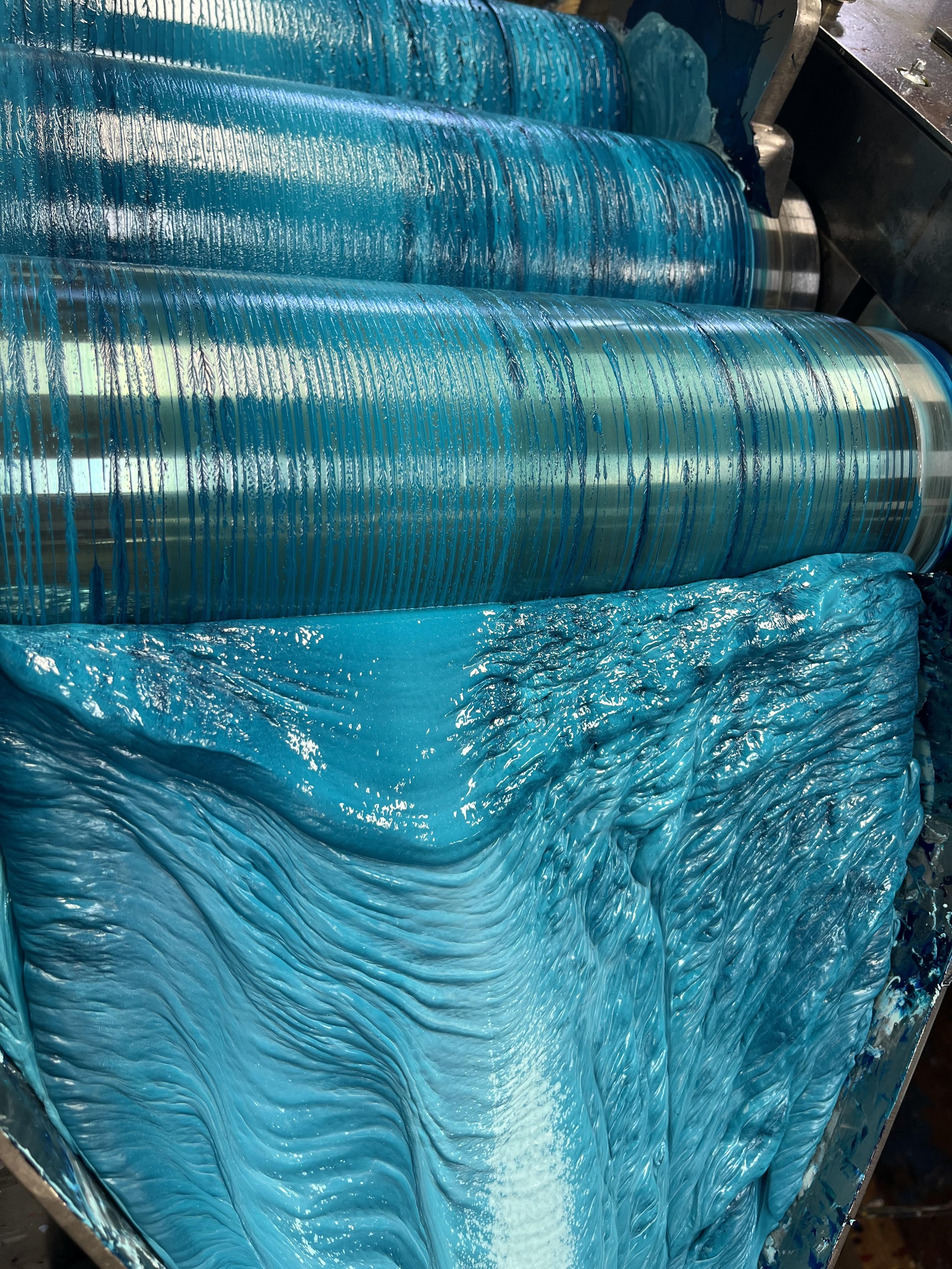
I am the Assistant Manager of Paintmaking. My day to day activities are creating a weekly schedule to make encaustic and Pigment Sticks®, ensuring quality control of the paint, and making sure everyone in Production has the time, tools, and materials they need to complete their assigned colors for the day. Part of my job involves milling paint on our three-roll mills and measuring raw materials in the pigment room.
You'll also find me rummaging through our vast CD collection in the shop for the Tom Waits albums my coworkers patiently listen to in the early hours of the morning.
How many years have you been working for R&F?
I started working for R&F in 2015 in Post-Production. After completing college, I moved on to Paintmaking. But I started doing studio work through the workshop program as a high school student around 2010. I met Richard when he visited my Chemistry-in-Art class in high school where he taught students about color, light, and pigment.
From that point on, R&F has been a second home for me.

What do you do outside of work? Do you have an art background or related practice?
I earned a Bachelor of Science in Visual Art and a Minor in Art History after completing my college education at SUNY Ulster and SUNY New Paltz. I have been exploring the arts and crafts qualities of sewing, embroidery, and hand-quilting for the last few years, but I often describe myself as a jack of all trades, master of none.
I love to cook, garden, hike, and read. I recently began volunteering at the local SPCA a couple days a week as well.

If someone came to visit Kingston, what's one thing you would recommend they see/ do/ eat/ experience?
Visit one of the farmer's markets to experience the fresh, local produce and to connect with the various groups and organizations in the area. The Saturday farmer's market in Uptown often looks like a small festival in the summer, but during the week it is worthwhile to visit the YMCA Farm Project in Midtown. They have quality produce made by local youth in their own garden.

Favorite color in R&F's paint line?
I really enjoy making Indigo on the mill. The saturated qualities of the Ultramarine Blue and Prussian Blue melding with the earthy Raw Umber turns into this mysterious, borderline spooky hue. I also have a soft spot for Green Gold. When it is extended using encaustic medium or Blending Medium, it reveals an undertone reminiscent of sunlight moving through late-summer leaves.
Upcoming Core & Tier Workshops: 2022 + Beyond
R&F launched the Core Support Program in 2016 and the Tier Support Program in 2020. These programs were designed to help instructors broaden the reach of their teaching and share our materials with their students. While participation in the Core and Tier programs are invitation-only at this time, R&F provides materials to support a range of workshop instructors across the country.

R&F launched the Core Support Program in 2016 and the Tier Support Program in 2020. These programs were designed to help instructors broaden the reach of their teaching and share our materials with their students. While participation in the Core and Tier programs are invitation-only at this time, R&F provides materials to support a range of workshop instructors across the country.
Are you looking for a teacher in your area? Check out our Teaching Artist List - downloadable as a handy PDF with links to each artist's website.
Teaching workshops? Give us a shout so we can discuss how to support you: info@rfpaints.com.
Below is a sample list of upcoming workshops offered by our Core and Tier instructors.

10/22 - 10/23/22: Design, Depth & Color with Leslie Giuliani, Leslie Giuliani Studio, Weston, CT lesliegiuliani.com
10/22 - 10/23/22: Encaustic Workshop with Caryl St. Ama, Beatrice Woods Center for the Arts, Ojai, CA beatricewood.com
10/29 - 10/30/22: Drawing and Painting With Pigment Sticks® with Sara Post, The Pence Gallery, Davis, CA
pencegallery.org
11/10 - 11/13/22: Silkscreen Onto Encaustic with Jeff Hirst, Jeffrey Hirst Painting and Printmaking Studio, Chicago, IL jeffreyhirst.com
11/11 - 11/13/22: Abstract Mixed Media Encaustic with Lorraine Glessner, FountainHead Art Center, Atlanta, GA
fountainheadartspace.com
11/18/22: Introduction to Encaustic Painting with Debra Claffey, Online via Zoom debraclaffey.com
12/2 - 12/3/22: Painting With R&F Pigment Sticks & Mixed Media with Lisa Pressman, South Short Art Center, Cohasset, MA lisapressman.net
1/26 - 1/29/23: Embodiment: Symbolic Self Portrait Encaustic & Mixed Media Workshop with Kelly Williams, Kelly Williams Studio, Portland, OR kellywilliamsart.com
2/18 - 2/20/23: Mark Making, Drawing & Encaustic with Susan Stover, Tubac School of Fine Arts, Tubac, AZ susanstover.com
3/9 - 3/11/23: Advanced Encaustic with Julie Snidle, Eastern Shore Art Center, Fairhope, AL juliesnidle.com
3/11 - 3/12/23: Encaustic Painting with Shelley Jean, Island Art Association, Fernandina Beach, FL shelleyjean.com
7/22 - 7/29/23: Offerings to Aine: An Encaustic & Mixed Media Workshop with Michelle Belto, Essence of Mulranny Studio, Ireland michellebelto.com
7/23 - 7/28/23: Encaustic, Mindfulness & The Natural World: An Artist Retreat with Dietlind Vander Schaaf, Wild Rice Retreat, Bayfield, WI wildriceretreat.com
9/24 - 9/29/23: Making Your Mark With Encaustic & Photo Collage with Jodi Reeb, Penland School of Crafts, Baskerville, NC jodireeb.com
Notes on Color: Brilliant Yellow Extra Pale, Cobalt Turquoise & Veronese Green
We’re back with another edition of Notes On Color - our platform for sharing our thoughts on color. This week we’re highlighting Brilliant Yellow Extra Pale, Cobalt Turquoise, and Veronese.

We’re back with another edition of Notes On Color - our platform for sharing our thoughts on color. This week we’re highlighting Brilliant Yellow Extra Pale, Cobalt Turquoise, and Veronese.
Just a reminder that you can find all our blog posts - from tips on color mixing to suggestions about how to choose a color - neatly organized for you on our Articles & Links page.
Enjoy. Keep painting.
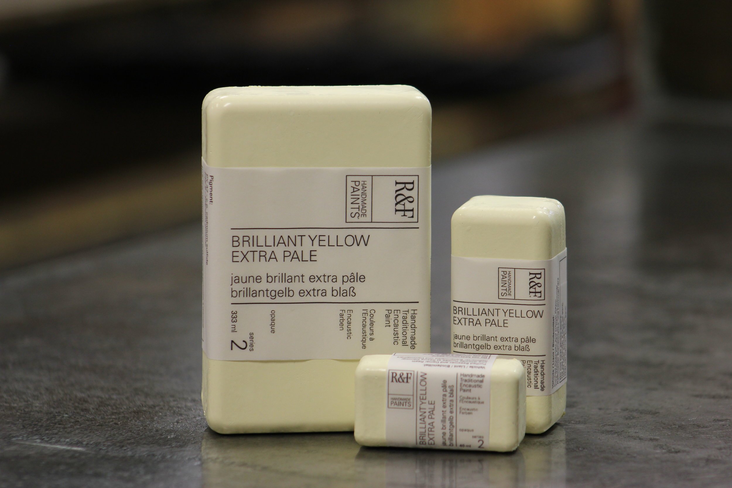
Brilliant Yellow Extra Pale. Its paleness makes it more of a warm yellowish off-white than a true yellow. Has the effect of soft diffused light.
Available in both our encaustic and Pigment Stick® color lines. Opaque with a Pigment Stick® drying rate of slow.
Chemical Composition: Titanium-Zinc White + Cadmium Yellow.


Cobalt Turquoise. Our Cobalt Turquoise has a deep vivid greenish blue undertone, while its top tone is dark and somber.
Available in both our encaustic and Pigment Stick® color lines. Semi Transparent with a Pigment Stick® drying rate of fast.
Chemical Composition: Cobalt Blue + Viridian.


Veronese Green. Brighter and bluer than Cadmium Green. Favored by the French Impressionists. The original (no longer made) was arsenic based and very toxic.
Available in both our encaustic and Pigment Stick® color lines. Opaque with a medium Pigment Stick® drying rate.
Chemical Composition: Cadmium Yellow, Phthalo Green, Titanium-Zinc White.

Meet The Team: Richard Frumess
Our ongoing feature "Meet The Team" is our way of introducing you to the fine folks behind the scenes who make R&F possible. Many of you will already be familiar with this week’s featured team member - founder Richard Frumess.

Our ongoing feature "Meet The Team" is our way of introducing you to the fine folks behind the scenes who make R&F possible. Many of you will already be familiar with this week’s featured team member - founder Richard Frumess.

Please provide a brief description of what you do day to day at R&F.
Technical consulting, public relations, community outreach, and the occasional color workshop.
How many years have you been working for R&F?
34 1/2 years. I was there from the beginning, you might say.
What do you do outside of work? Do you have an art background or related practice?
I am involved in the development of the Kingston Midtown Arts District. Before starting R&F, I was a painter and worked in an art store.
If someone came to visit Kingston, what's one thing you would recommend they see, do, eat, or experience?
Check out the art scene -- we have some great galleries and events. Drive around to experience a sense of the city and its various neighborhoods and be sure to see the 17th century building from the time the Dutch ruled the area. You can also check out some of the relics of the time when Kingston was a major port in the canal system. If you have time, hike or bike the rail trails, which are reminders of the era when Kingston was a rail center.

Favorite color in R&F's paint line?
There is no one color, but a class of colors that we make here at R&F that I am very proud of. These are what I call the "complex earth colors," based on mixes of earth pigments and translucent spectrum colors. We are almost alone among companies to offer them. This is no doubt due to the fact that they are composed of 3-5 different pigments, are labor intensive and very tricky to make. But the complexity of top tones and under tones that they provide the artist makes it worth it and makes our color line truly unique.
Although I developed the original group of complex earth colors, I am very proud of the fact that all the recent mixes have been by our paint-makers, whose interest and dedication guarantees that the quality and innovativeness of our color line continues on.
Notes On Color: Mars Yellow Deep, Sepia & Warm Pink
We’re back with another edition of Notes On Color - our platform for sharing our thoughts on color. This week we’re highlighting Mars Yellow Deep, Sepia, and Warm Pink.

We’re back with another edition of Notes On Color - our platform for sharing our thoughts on color. This week we’re highlighting Mars Yellow Deep, Sepia, and Warm Pink.
Just a reminder that you can find all our blog posts - from tips on color mixing to suggestions about how to choose a color - neatly organized for you on our Articles & Links page.
Enjoy. Keep painting.

Mars Yellow Deep. Warm, slightly reddish. Top tone is a bit like Raw Sienna but denser and brighter.
Mars Yellow Deep is a single pigment - iron oxide - and it is relatively straightforward to process on the three-roll mill, possessing what we in the biz call 'good dispersibility.' It does, however, present challenges on the pouring end of our production process. The same density and opacity that make for great painting experiences make for very long paint-making days. A tough one to clean up after - the color never goes away.
Available in both our encaustic and Pigment Stick® color lines. Opaque with a fast drying rate.
Chemical Composition: synthesized iron oxide, precipitated.

Sepia. A deep purplish brown. Developed to match the color of the ink from cuttlefish, the traditional source of sepia. The reddishness associated with the sepia washes of Renaissance drawings is often faded from the natural color. Ours is permanent.
Sepia is Richard Frumess at his finest - nuanced and subtle, warm and cool at the same time. What we refer to around here as ‘complex.’ This formulation found its place in the R&F color line 26 years ago (the first batch was made on 4/10/1996).
Many a paint maker past and present has bemoaned its presence on the production schedule. Not because it’s not an interesting color to make or use; but because it’s a beast to get right. Sepia contains five pigments. Each of these pigments (every pigment actually) has a unique personality. The paint maker’s job is to bring out the distinctive traits of a pigment – make them known for the painter, but also get them to play well with each other. Mill one component too tightly and it could dominate, or worse, fall flat.
But when these mixes work out, when all the pieces come together as intended, the result can deliver a complexity and depth unmatched by any ‘single pigment’ color.
Available in both our encaustic and Pigment Stick® color lines. Semi-Transparent with a Pigment Stick® drying rate of medium.
Chemical Composition: titanium-zinc white, quinacridone magenta, brown pink, and ultramarine blue.


Warm Pink. Warm Pink is beloved for its intense salmon hue. R&F is at its best when it lands in color spaces hard to pin down. Warm pink is a restless color. Somehow managing to display both earthy tones and cool, bluish notes without containing either earth or blue pigments. A personal favorite.
Opaque with a slow Pigment Stick® drying rate, it is available in both our encaustic and Pigment Stick® color lines.
Chemical Composition: quinacridone red, cadmium red, cadmium yellow, and titanium-zinc white.


R&F's Opaque Color Set: Working From A Limited Color Palette
Limiting your color palette can be a fun way to experiment with color mixing and has the added benefit of creating greater balance in your work. In our newest demo video, we highlight the range of colors that can be created using the six encaustic paints that come in our Opaque Color Set: Ivory Black, Cobalt Blue, Chromium Oxide Green, Cadmium Red Medium, Cadmium Yellow Medium, and Titanium White.

Limiting your color palette can be a fun way to experiment with color mixing and has the added benefit of creating greater balance in your work.
In our newest demo video, we highlight the range of colors that can be created using the six encaustic paints that come in our Opaque Color Set: Ivory Black, Cobalt Blue, Chromium Oxide Green, Cadmium Red Medium, Cadmium Yellow Medium, and Titanium White.
A simple way to begin exploring color mixing with our Opaque Color Set is to take Cobalt Blue, Cadmium Yellow Medium, Chromium Oxide Green, and Cadmium Red Medium and add Titanium White to each of them. Adding white lightens and desaturates a color, creates tints. Tints are less intense and are often perceived as quieter or calmer. When mixing tints, you can add up to equal parts color and white.
Next, add a small amount of Ivory Black to each of your tints. These additions will lighten or darken your colors, reducing the saturation, and developing a variety of tones. It can be easy to quickly overdue the amount of black you add, so work gradually with just a little black adding more if necessary.
Next, take Cobalt Blue, Cadmium Yellow Medium, Chromium Oxide Green, and Cadmium Red Medium and add a small amount of Ivory Black to each color. This will give you an assortment of shades, which can be more intense, richer, and darker than your original colors.

In our color mixing demo video, we had fun exploring a variety color mixing techniques. Below you will find each of the colors and mixes listed in the order in which they appear in our demo.
Cobalt Blue
Cobalt Blue + Titanium White
Cobalt Blue + Titanium White + Ivory Black
Cadmium Red
Cadmium Red + Titanium White
Cadmium Red + Titanium White + Ivory Black
Cadmium Yellow Medium
Cadmium Yellow Medium + Titanium White
Cadmium Yellow Medium + Titanium White + Ivory Black
Chromium Oxide Green
Chromium Oxide Green + Titanium White
Chromium Oxide Green + Titanium White + Ivory Black
Cadmium Yellow Medium + Chromium Oxide Green
Cadmium Red Medium + Cobalt Blue
Cadmium Red Medium + Cobalt Blue + Titanium White
Cadmium Yellow Medium + Cobalt Blue
Cadmium Yellow Medium + Cobalt Blue + Titanium White
Cadmium Red + Cadmium Yellow Medium
Cadmium Red + Cadmium Yellow Medium + Titanium White
Cadmium Red + Chromium Oxide Green
Titanium White + a “dirty” brush that had some light blue paint on it + Cadmium Red
Titanium White + a “dirty” brush that had some light blue paint on it + Cadmium Red + Cobalt Blue
Ivory Black
Ivory Black + Titanium White
Cobalt Blue + Titanium White + Cadmium Yellow Medium
Meet The Team: Allison Carroll
Our ongoing feature "Meet The Team" is our way of introducing you to the fine folks behind the scenes who make R&F possible. In this week’s installment, you will meet Allison Carroll in Sales.

Our ongoing feature "Meet The Team" is our way of introducing you to the fine folks behind the scenes who make R&F possible. In this week’s installment, you will meet Allison Carroll in Sales.

Allison Carroll, Metropolis (detail), 30” x 22”, encaustic and mixed media on paper, 2019.
Please provide a brief description of what you do day to day at R&F.
In addition to my ongoing pursuit of good espresso, I'm an avid desk jockey. My day is filled with processing orders/invoicing, communicating with retailers, facilitating freight/international shipments, etc. Truly my day begins with organization and relaying project information to our phenomenal shipping team.
More than likely, I was in my teammates shoes at one time or another and can understand the ripple effect my orders create on the work schedule.
All my office mates and myself are attentive to inquiries. I've heard about every question there is about working with both our paint lines and it's great fun to work through an artist's project with them.
My coworkers at R&F are wonderful and 'hard worker bees' (we're avid pun makers, you're welcome Richard!) and I stay very conscious about supporting my team day-to-day the best I can. It is an absolute joy to come to work everyday.
How many years have you been working for R&F?
Once fall arrives it will be 10 years! I began working part time in the shipping department and in production, then was promoted to a full time office position.

Allison’s wildflowers at Brown Pink.
What do you do outside of work? Do you have an art background or related practice?
I am a Hudson Valley native with a BFA in Painting and Drawing from the State University of New Work at New Paltz. When I'm not dreaming about or researching about a studio project, you could find me digging trenches in a garden (bee friendly and dye plants), absorbing classic film to camp B-movies, making sustainable clothing and housewares, hiking while avoiding direct sunlight, reading manga, and practicing yoga.

If someone came to visit Kingston, what's one thing you would recommend they see, do, eat, or experience?
I would recommend first taking a walk on the "strand" by the water. It has a unique Kingston charm to it. Then take a hike from there around Kingston point. You can find oodles of brilliant galleries and museums in this area.
During the summer months I would take a look at what is showing on any given weekend. Also, I have a soft spot for the grounds at Olana State Historic Site in Hudson, NY.

Allison Carroll, Shelley, 12” x 9”, encaustic on panel, 2022.
Favorite color in R&F's paint line?
This is a hard question for any artist. Certainly by working in a metaphorical 'candy store' it is impossible to not see the majesty in every single color. However, if I had to choose right this moment it would be a tight race between Payne's Grey and Courbet Green. Courbet Green has complicated depth with the undertone and Payne's Grey is a mysterious, semi-transparent color I fall in love with whenever I watch the color spread across my piece.
You can see more of Allison’s work at allisoncarrollstudio.com or follow her on Instagram @allisoninthestudio.
Matt Kleberg: Extended Stay - A Unique Color Collaboration
Matt, a long time and avid user of R&F Pigment Sticks®, explores color and form to create work hovering between realms of pure abstraction and strict representation. The work exists here and there, and in that way is timeless. The finished paintings are often informed by and suggest architectural elements such as doorways and windows. They read as private spaces of contemplation, divine portals of light and form.

Reference photo sent from Matt Kleberg to R&F’s R+D Dept. for our Unique Color collaboration. The second block from the top would become our Limited Edition Quinacridone Magenta Light and the third, green block, would become Limited Edition Verdigris.
The plan went something like this.
Let’s invite an artist to come and spend some time with us here at 84 Ten Broeck, to work alongside our paint making and post production teams. We’ll put them up at Brown Pink, our Artist Residency just down the road. That way we’ll have all the time in the world to look at color, talk about color and hopefully, if all goes according to plan, combine our efforts to create a limited edition color we might then share with the world - a ‘Unique Color’ collaboration if you will.
Insert artist and wonderful human being, Matt Kleberg. Matt, a long time and avid user of R&F Pigment Sticks®, explores color and form to create work hovering between realms of pure abstraction and strict representation. The work exists here and there, and in that way is timeless. The finished paintings are often informed by and suggest architectural elements such as doorways and windows. They read as private spaces of contemplation, divine portals of light and form.

Matt Kleberg, Cheek to Jowl, Pigment Stick® on canvas, 66” x 60”, 2021. Image courtesy of Sorry We’re Closed, Brussels and the artist.
Matt’s process of direct observation, photographic documentation, and a near devotional drawing practice ultimately inform his painting practice. As we learned in our time together, Matt applies Pigment Stick® directly to the canvas surface. There is no brush, no tape, just a steady hand and time.

Reference photo from Matt Kleberg to R&F’s R+D Dept. Matt took this photo while on residency in Puglia, Italy early this year. The deep, emerald green would serve as inspiration for what would become Verdigris.

Matt Kleberg’s Verdigris Color Study, Pigment Stick® on paper, 9” x 12”, 2022. Verdigris is in the center surrounded by Viridian, Veronese Green, Malachite, Chromium Oxide Green, Courbet Green and Green Earth.
Matt Kleberg shares his process with the R&F Team.
Almost everything went according to plan. Matt flew in from San Antonio, TX and settled in nicely at Brown Pink. We got straight to work. We showed him what we do and how we do it. In return, Matt, ever generous and open, shared his process as well. We got our collective hands dirty and had a great time in the process.

Matt Kleberg with Senior Paint Maker and R&D Specialist, Maddison Ginter.
Here’s where the plan went slightly awry.
Before Matt tested positive for Covid-19 (oof!) and had to extend his stay at Brown Pink, we managed to make not one limited edition color as we had hoped, but three!
Thankfully, Matt made a full recovery and managed to use his isolation time at Brown Pink productively, making many beautiful drawings. Some of these color studies can be seen in Extended Stay: a Unique Color collaboration up now in R&F’s Gallery: Work in Progress.
Matt Kleberg’s color studies. Pigment Stick® on paper, 9” x 12”, 2022.
The three limited edition, 38 ml Pigment Sticks® colors (below) will be released soon as part of a new (6) color Unique Color Set that also includes Olive Yellow, Prussian Blue, and Green Gold Pale.
Verdigris: a deep, emerald green, reminiscent of Viridian’s top tone but significantly more opaque. Contains Titanium-Zinc White (PW6 + PW4), Phthalo Green (PG7) and Mars Yellow Light (PY42).
Quinacridone Magenta Light: a Quinacridone Magenta tint. Cool, bluish, edgy. Contains Titanium-Zinc White (PW6 + PW4) and Quinacridone Magenta (PV19).
Cadmium Coral: a clean and warm Cadmium Red Light tint. Contains Titanium-Zinc White (PW6 + PW4) and Cadmium Red Light (PR108).

R&F’s Unique Color Limited Edition Color Set will be available next month. Check with your local retailer for more information.
Artist Spotlight: Kate Collyer
Kate Collyer lives and works in the Hudson Valley where she serves as adjunct professor for several universities in the area and teaches an annual workshop at R&F. Kate received her MFA in Printmaking from SUNY New Paltz and is currently a Studio Art PhD candidate at the Burren College of Art in Ireland.
Kate Collyer, Untitled, 8” x 11”, Pigment Stick® found material monoprint with linocut and Pigment Stick® drawing, 2019.
Kate Collyer lives and works in the Hudson Valley where she serves as adjunct professor for several universities in the area and teaches an annual workshop at R&F. Kate received her MFA in Printmaking from SUNY New Paltz and is currently a Studio Art PhD candidate at the Burren College of Art in Ireland.
Her work has been exhibited extensively, including internationally in Poland, Switzerland, Portugal, Japan, Australia, and Canada. She was the 2014 recipient of the Southern Graphics Council International Graduate Fellowship Award and her work is in the permanent collections of the SMTG Krakow Printmaking Triennial Collection, the SGC International Archives at the Zuckerman Museum of Art, and the Morgan Art of Papermaking Conservatory and Educational Foundation, among others.
Both printmaker and storyteller, Kate notes in her artist statement that “throughout time, oral tradition and myth have been used to connect us to our environment in ways that bypass ‘from-ness’, giving us the literacy of a landscape… [and] resulting in a moral - a better understanding of a truth - that allows one to see where they are more clearly.”
Can you tell us a little about yourself? How did you get your start as an artist?
I have always been creative. There are photographs of me as a toddler making art at my father's drafting desk. It was during my undergraduate studies that I merged my love for making with my desire to educate.
As an adult, I've spent many years in international artists residencies, most recently the Arctic Circle Residency in Svalbard, the Cape Breton Centre for Craft & Design in Nova Scotia, and Edition/Basel in Switzerland.
Kate Collyer, Desert Scape, 4” x 12”, paper lithograph with encaustic and watercolor in a handmade bookcloth cylinder box with walnut, 2020.
What are you currently working on in the studio? How has your work evolved over the years?
The backbone of my current practice is my research for my PhD candidacy. With a focus on landscape, pathways, and wayfaring, I explore the historical bond that we have created with the landscape. My intention is for viewers to empathize with the sites I reveal in my art, spurring stewardship.
A goal is to create prints within a variety of mediums and techniques to expand the definition of what a print can be and to give viewers the opportunity to interpret and reimagine, drawing insight from these recollections of place.
My current body of work involves a merging of materials - paper, ceramic, glass, and wood. These works of art are meant to be immersive; I want the experience you have with my pieces to mimic the feelings and care with which we should be handling our environment.
My work has been continually driven by our environment and the expeditions that I have been lucky to take, both personally and through art residencies. There have been subtle shifts in what landscapes I have highlighted.
Early in my career I had a focus on National Parks. Then my residencies led me to the ice laden areas around the North Pole. With my current research I am diving headlong into the International Appalachian Trail.
You will be teaching A Malleable Process: The Making Of Print with Encaustic November 18 - 19. What does this workshops focus on and what can students expect to leave with?
Much like with my own work, A Malleable Process is about opportunities and what printmaking can bring to new materials. Print is such a versatile medium and is a wonderful companion to encaustic. The goal of this class is to give students experience with several printmaking techniques, including how to use these techniques with encaustic paint and Pigment Sticks®. We will rework prints multiple times during the workshop to create thoughtful and layered finished pieces.
The beauty of both print and encaustic is that if something does not turn out exactly as you have envisioned, it can become the beginning of a completely new work. Students will leave with a large series of prints and several print plates.
None of the techniques taught require the use of a press, so any home studio can absorb what is learned for continued development.

Kate Collyer, Untitled, 8” x 11”, Pigment Stick® found material monoprint with linocut and Pigment Stick® drawing, 2019.
What keeps you motivated in the studio? What is your typical studio day like? What's next on your horizon?
I am never not learning and exploring. There is always a new place to see and new materials to play with. Translating the beauty and phenomena that make up the landscapes around us is always new to me. Exploring new techniques is one of my vices, for sure. Perpetually staying a student and continuing my education keeps me motivated. I have found that I do my best work and am my most prolific when I have research I am responsible for. To also have critical eyes on my process, for me, is invaluable.

Kate Collyer, Iceland I & II, 2” x 3”, encaustic monotype on silk tissue with toner transfer, 2018.
The ability to continue my own education and to have a home printmaking, glass, and encaustic studio is an immense privilege. I have a young daughter so my studio days are very disjointed. I spend a large number of small bits of time working each day. I break down my making into smaller tasks so that I move forward, while only getting a half an hour to work at a time (babies are wonderful, but not for studio time...). This gives me inactive time to develop my works and troubleshoot as I go, which has been nice. I do a lot of planning for all of my pieces, so my making is very intentional and methodical.
I am currently making work for two big exhibitions. One, at the end of this year, is a group show with my art collective, Boundary Walkers, at Stand4 Gallery in Brooklyn. For much of next year I will have work in a solo exhibition at Sheridan College in Wyoming.
Anything else you'd like our readers to know?
Both encaustic and printmaking can get frustrating, especially when you are new to the materials and processes. The beauty of both of these and what I will highlight in my workshop are the possibilities. It is a liberating moment when you don't like what you just made, but immediately start thinking about what it CAN be.
To learn more about Kate and see additional images of her work, visit katecollyer.com.
To register for A Malleable Process: The Making Of Print with Encaustic visit rfpaints.com/workshops.
Ask Richard: Green Earth
Each of our color swatches is a study in and of itself. We check the subtle shifts in color, gradations, and undertone to ensure our paint meets our standards. Since 1988, our primary goal has been the development of an extensive and unique color line. We take pride in creating the highest quality products we can and consistency is an important part of that process.

Color mixing is an art. We take it very seriously at R&F. Tour our paint-making production facility and chances are you will see us testing color to make sure we get it just right.

Each of our color swatches is a study in and of itself. We check the subtle shifts in color, gradations, and undertone to ensure our paint meets our standards. Since 1988, our primary goal has been the development of an extensive and unique color line. We take pride in creating the highest quality products we can and consistency is an important part of that process.
If you’ve been to R&F recently for a workshop, you might have seen a small framed scrap of paper with different swatches of color on it hanging in one of our offices. We reached out to founder Richard Frumess to see what he could tell us about this color study and got a tiny peek into the history of R&F and the evolution of color.
Enjoy. And keep painting.
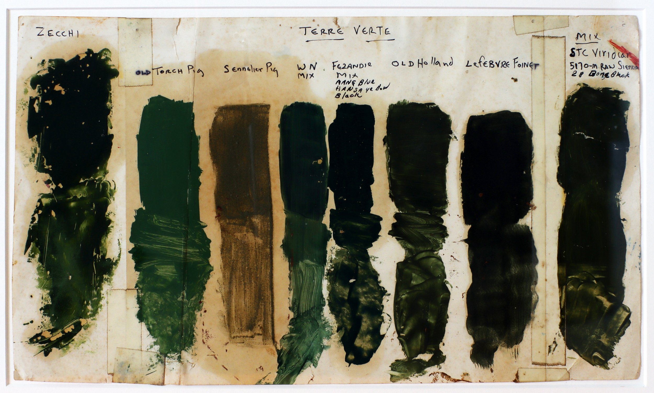
“This chart dates to my painting days in Brooklyn before I started R&F. I was comparing, as you can see, different brands of Terre Verte (Green Earth). Some were mixes, some genuine earth. I liked Old Holland's the most and felt I came pretty close to it with my mix.
When I decided to add Green Earth to our color line for R&F several years later, I knew I'd have to mix it since genuine Green Earth is heat sensitive and browns.
I thought it would be no big deal since I already knew the mix. But when I tried it, it didn't work. It looked like mud. So I tried other combinations with the same result. I was very puzzled and tried numerous pigment combinations and proportions. They didn't work either.

R&F’s Green Earth Pigment Stick®.
I worked on it for months until I realized the problem. I was intent on making heavily pigmented paint, which is fine in single colors and most opaque mixes. But for translucent mixes employing earth pigments, the pigment load needed to be reduced to bring out their undertones.
The minute I did that, all the mixes I tried were close, especially my original mix of Viridian, Raw Sienna, and Ivory Black. I switched out the black for Ultramarine Blue, which made the color sweeter. And later, when we added Stil-de-Grain to the line we used that to replace the Raw Sienna, which gave the color more clarity.
The concept of varying the pigment load to bring out all the tonalities of the color laid the basis for our complex earth mixes and their magical shifts in color as the pigments separate out in manipulating the paint.”
-Richard Frumess
Meet The Team: Carina Quackenbush
We are proud of all of our employees, from our paint-makers to the folks answering the phone and packing orders, and everyone in between. Our ongoing feature "Meet The Team" is our way of introducing you to the fine folks behind the scenes who make R&F possible. In this week’s installment, you will meet Carina Quackenbush.

We are proud of all of our employees, from our paint-makers to the folks answering the phone and packing orders, and everyone in between. Our ongoing feature "Meet The Team" is our way of introducing you to the fine folks behind the scenes who make R&F possible. In this week’s installment, you will meet Carina Quackenbush.

Please tell us your job title and a brief description of what you do day to day at R&F.
I'm in post-production. I specifically take care of a lot of the sets (if you've bought a set lately, odds are good that I assembled it!), but I also wrap paint and work on things like our hand-painted color charts.
How many years have you been working for R&F?
I started at R&F in late summer 2021, so I've been here just under a year.


What do you do outside of work? Do you have an art background or related practice?
My formal education is in writing, communications, and marketing, but I studied art informally all through school and still paint, craft, and draw in my free time.
I've loved reconnecting with art while working at R&F, something I had neglected since leaving high school. Kingston has a really vibrant arts community and R&F is a great facet of it.
I am also studying cat behavior and am beginning to work as a behavior consultant to help people with their various house cat issues and questions. My website is catsinterrupted.com.
If someone came to visit Kingston, what's one thing you would recommend they see/ do/ eat/ experience?
One of my favorite places in Kingston is Rough Draft, I always recommend you pop in if you're in Kingston. The building is a perfect example of the old stone architecture you find in the valley. The people are very kind, the drinks are great, and it's really special to have an independent local book store to rely on.
I live in walking distance, which is extra nice (and a little dangerous to my book and coffee budget, haha). Anthony and Amanda are usually open to special ordering a book for you if you don't see it in store. The community-centered events are great. I can't wait for weekly trivia night to start up again.

Favorite color in R&F's paint line?
If I HAD to pick a top favorite color at R&F, I think I'd choose our Indigo Pigment Stick®. Every variation from the top tone to the undertone has something special. It's moody, earthy, and really fun to play with.
Notes On Color: Blue Ochre, King's Blue & Azure Blue
In our newest feature - Notes On Color - we will share with you a few of our thoughts each week on color. Maybe you'll learn a thing or two. Maybe you'll discover a color you aren't using already and must acquire. At the very least, we hope you find this entertaining. It's full of eye candy for you color aficionados.
Here at R&F we love blue. I mean, we really love blue. Which is why we make so many different versions. Seventeen different blues to be precise.
In our newest feature - Notes On Color - we will share with you a few of our thoughts each week on color. Maybe you'll learn a thing or two. Maybe you'll discover a color you aren't using already and must acquire. At the very least, we hope you find this entertaining. It's full of eye candy for you color aficionados.
You can find all our posts on color - from tips on color mixing to suggestions about how to choose a color - neatly organized for you on our Articles & Links page at rfpaints.com.
Enjoy. Keep painting.

Azure Blue. A bright, slightly greenish light blue, Azure can act like a high-keyed Cerulean. In the picture above you can see us working on the Phthalo Blue part of the Azure Blue process.
We mill our Phthalos separately from the rest of our mixes because they have a much smaller particle size and therefore require a more thorough (tighter) milling. In the case of Azure, we mill the Phthalo Blue multiple times by itself until we achieve a consistent, evenly dispersed grind (particle size is measured with a Hegman Gauge). We then mill the Titanium-Zinc and Ultramarine Blue parts of the mix, combine all pigments, and mill a final time until the final color is fully developed.
Available in both our encaustic and Pigment Stick® color lines. Opaque with a slow drying rate. Chemical Composition: phthalo blue, ultramarine blue, zinc-titanium white.


Blue Ochre. The top tone and undertone of Blue Ochre have the same kind of edginess as our Indigo, but that is where the similarity ends. This totally different mix is much greener and still very blue. Rubbing it out reveals a surprising yellowish brown.
Many of our complex mixes are a result of intentional research and development. In other words, we get a color idea and pursue it until we arrive at something close to what we're looking for. This wasn't at all the case with Blue Ochre. Blue Ochre was a serendipitous discovery, born at the mill by paint makers making paint.
As is often the case during the milling process, unmilled pigment and linseed oil collect on the wax paper where our tools rest. One of our paint makers was making Cobalt Blue Pigment Stick® and another, Raw Sienna Pigment Stick®. Out of curiosity, we began hand mixing the milled Cobalt Blue with the unmilled Raw Sienna. The results were captivating.
Pairing the opaque Cobalt Blue with the transparent (very loosely milled) Raw Sienna allowed for a dynamic, dusky blue that will go almost green with just a little bit of pressure.
Available in both our encaustic and Pigment Stick® color lines. Semi-Transparent with a Pigment Stick® drying rate of medium. Chemical composition: cobalt blue and raw sienna.


King's Blue. A very warm, soft light blue. With cool colors, King's Blue can be almost neutral. Alongside warm colors, you'll glimpse hints of lavender, like a blue that's hiding a rose.
Available in both our encaustic and Pigment Stick® color lines. Opaque with a Pigment Stick® drying rate of medium. Chemical composition: cobalt blue and zinc-titanium white.


Latest Posts
Brown Pink: Creating Your Own Artist Residency
Workshops with R&F Instructors: Winter into Spring 2024
Artist Spotlight: Joanna Kidney
Artist Spotlight: Henry Curchod
Artist Spotlight: Kelly Milukas
WORK IN PROGRESS: Pigment Stick® Drying Test
Lora Murphy on Painting With Fire & Essence of Mulranny
Artist Spotlight: Mike Tapogna
R&F Blending Medium: With and Without Drier
How To Pick A Palette with Julie Snidle
OZNZ: Encaustic in Australia and New Zealand
Artist Spotlight: Halim Flowers
Artist Spotlight: Julie Snidle
Notes On Color: Chromatic Tones
The 16th International Encaustic Conference
Artist Spotlight: Dale O. Roberts
Notes On Color: Translucent Color Set
R&F's 2023 Artists-In-Residence: Brad Ellis, Henry Curchod & Kuzana Ogg
Notes On Color: Brilliant Yellow Extra Pale, Cobalt Turquoise & Veronese Green
Meet The Team: Richard Frumess
Notes On Color: Mars Yellow Deep, Sepia & Warm Pink
R&F’s Opaque Color Set: Working From A Limited Palette
Meet The Team: Allison Carroll
Matt Kleberg: Extended Stay - A Unique Color Collaboration
Artist Spotlight: Kate Collyer
Meet The Team: Carina Quackenbush
Notes On Color: Blue Ochre, King’s Blue & Azure Blue
Meet The Team: Dietlind Vander Schaaf
Artist Spotlight: Lisa Pressman
From The Collection: Wayne Montecalvo
The Diptych Project: Transatlantic Fusion at the International Encaustic Conference
Color Mixing with Jeff Hirst, Jodi Reeb, & Lorraine Glessner
From The Collection: Laura Moriarty
International Workshops: Lyn Kirkland & Julie Ann Wrathall
Artist Spotlight: Sharon Paster
Artist Spotlight: Leslie Giuliani
Video, Virtual, & Online Workshops
Color Mixing with Debra Claffey & Susan Stover
International Workshops: Bettina Egli Sennhauser & Kunstfreiraum
Artist Spotlight: Margaret Ryall
Color Mixing with Julie Snidle and Dietlind Vander Schaaf
International Workshops: Janise Yntema & Zijdelings
The 15th International Encaustic Conference
2022 Multiday Workshops Open for Registration
2022 Mini Workshops Now Available
R&F Comprehensive Workshop in Glendale California
The Encaustic Painter’s Dozen: Chromium Oxide Green, Alizarin Orange & Ultramarine Blue Pale
Shading: Azure Blue, Turkey Red, Cadmium Yellow Deep
The Encaustic Painter’s Dozen: Cobalt Blue, Burnt Sienna & Turkey Umber Pale
Artist Spotlight: Stephanie Roberts-Camello
New Video: Pigment Stick® Painter’s Dozen 2
The Encaustic Painter’s Dozen: Unbleached Titanium, Manganese Violet & Indigo
R&F Pigment Stick® Techniques: Trace Monotype
The Encaustic Painter’s Dozen: Titanium White, Olive Yellow & Ancient Gold
Tips & Tricks: Smooth & "Bubble Free" Encaustic Surface
The Encaustic Painter’s Dozen: A Limited Edition Set
Tinting: Turkey Umber Pale, Indanthrone, Nickel Yellow
Virtual Demo: Drawing Between Layers
Tips & Tricks: Markmaking With R&F Pigment Sticks®
Selecting A White In The R&F Color Line
Virtual Demo: The Versatility of Pigment Sticks®
Artist Spotlight: Kelly Austin Rolo
Selecting A Black From The R&F Color Line
Virtual Demo: Encaustic Painting on Paper
From The Collection: Debra Claffey
An Inspiring Visit With Leslie Giuliani At Brown Pink
Can You Combine Pigment Sticks With Tube Oil Paint?
Toptone And Undertone: Part Two
Virtual Demo: Encaustic Monotypes With Caryl St. Ama
Encaustic: Polishing Paintings
R&F Encaustic At Penland School Of Craft With Guest Blogger Julie Snidle
Tools & Techniques: Taping Panels
Virtual Demo: Leslie Giuliani On Printmaking With Encausticflex
Tools & Techniques: R&F Blending Medium With Drier
Virtual Demo: Jeff Hirst On Working Large With Transparent & Opaque Encaustic Paint
How To Store Encaustic And Pigment Stick® Artwork
In Conversation With Caryl St. Ama
From The Collection: David A. Clark
Is R&F Blending Medium The Same As Cold Wax Medium?
Virtual Demo: Adding Lines To Encaustic Paintings With Julie Snidle
Color Names: Sap Green & Raw Sienna
Retailers, Teachers & International Workshops
Where Do Our Color Names Come From?
The International Encaustic Conference is VIRTUAL - Don’t Miss Out!
Connecting Artists: Wayne Montecalvo & Nanette Rae Freeman
Virtual Demo: Encaustic & Photo Collage with Jodi Reeb
R&F Abroad: Experimental Printmaking In Ireland
R&F Pigment Sticks®: Gloves & Barrier Creams
From The Collection: Elise Wagner
Encaustic: It’s All About Temperature
R&F’s Core Instructors: 2021 Workshops & Happenings
Tricks & Tips: R&F Pigment Sticks®
Demo Video: Transparency & Opacity
Encaustic: Palette Setup & Temperature
From The Collection: Diana González Gandolfi
Encaustic: Helpful Tips & Tricks
Articles & Links Webpage + Virtual Demos
Painting With Transparent Colors
Making Your Own Artist Residency
Artist Spotlight: Adrian Arleo & Deborah Kapoor
Demo Video: Encaustic Scraping
Painting With Iridescent Colors
Meet R&F’s Tier Artists: Debra Claffey, Lorraine Glessner, Shelley Jean, Sara Post, & Kelly Williams
Ask Richard: Drying Times for Pigment Sticks
Removing “Skin” From Pigment Sticks
From The Collection: Abby Goldstein
Meet R&F’s International Encaustic Conference Scholarship Recipients
Virtual Studio Visit: Lisa Pressman, Caryl St. Ama, Anne Hebebrand & Jenny Nelson
The 14th International Encaustic Conference + A Scholarship Giveaway
Encaustic: How To Store Your Paint
Demo Video: R&F Pigment Sticks®
R&F Pigment Sticks®: How To Store Your Paint
From The Collection: Marina Thompson
People & Places: Marybeth Rothman, Allison B. Cooke & Belen Millan
Ask Richard: Achromatic Blacks, Chromatic Blacks & Chromatic Whites
People & Places: Cecile Chong, Brad Ellis & Flo Bartell
From The Collection: Nancy Natale
Artist Spotlight: Melanie Hulse
R&F Core: Catalyst Art Lab & More
Encaustic & Sculpture: Pamela Blum, Anna Wagner-Ott, & Susan Stover
Artist Spotlight: Humberto Fernandez
Painting The Landscape: Regina B. Quinn & Cherie Mittenthal
Painting The Landscape: Thomas Sarrantonio & Janise Yntema
Demo Video: Working with Stencils
People & Places: Tracy Penn, Alteronce Gumby & Shelley Jean
From The Collection: Don Maynard
People & Places: Brenden Spivey, Victoria Foster Harrison & Bettina Egli Sennhauser
Student & Teacher Experience: Jenna Jerman
Encaustic Technique: Working With Ink
Artist Spotlight: Jane Allen Nodine
Encaustic Technique: Gluing Paper to Panel
From The Collection: Leigh Palmer
Demo Video: How To Clean A Brush
People & Places: Tracey Adams, Sarah Rehmer & Joanna Kidney
People & Places: Toby Sisson, Kelly Sheppard Murray & AJ Grossman
From The Collection: Joanne Mattera
Artist Spotlight: Pamela W. Wallace
Techniques & Tools: Leaf Stencils
Techniques & Tools: Encaustic Inlay
Artist Spotlight: Wayne Montecalvo
Artist Spotlight: Leslie Giuliani
Online Learning with Lisa Pressman
From The Collection: Kevin Frank
From The Collection: Richard Purdy
From The Collection: Cat Crotchett
From The Collection: Lisa Pressman
Learn + Connect: Upcoming Events
From The Collection: Carol Bajen-Gahm
From The Collection: Lynnette Haggard
The International Encaustic Conference + An R&F Exhibition
Upcoming R&F Core Artist Workshops
Unique Color: Cobalt Turquoise
From The Collection: Rifka Angel